
10 Ways to Design An Effective Pricing Page

If you run a software-as-a-service (SaaS) business, or you only have one product to sell, then you probably have one single, dedicated pricing page.
Here's how to make sure your pricing page is effective:
1. Keep It Simple, Stupid
Let's start with some basic truths. People don't go to the Web to read. When they are presented with something to read on the Web, they skim. If it's too complicated to figure out, they skip. If they skip too much, they give up.
It makes sense to keep your pricing model simple, so when you start to build your pricing page, you need to make it as easy to understand as possible, and so drive conversions.
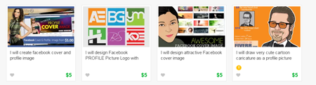
Subway has run a successful $5 foot-long campaign for some time now. If you want a foot-long sandwich at Subway, it costs $5. Fiverr exists because you pay $5 for someone there to provide you with the services you are looking for (image below). It's simple pricing, and it works.
SaaS companies tend to use tiered pricing. The more tiers you add, the greater the price becomes. Tiered pricing is fine, as long as the way that your pricing works could be understood by a 10-year-old.
2. Go compare
People gauge the value of your services by making comparisons. How the value of your product or service comes out against your competitors is what's going to win (or lose) you conversions and business. Make it easy to compare, and make sure you come out on top.
It's okay to list the features of your product, but at the end of the day, it's perceived value in monetary terms that's important.
Oddly enough, some companies take the exact opposite approach and make their products' prices difficult to compare. Airlines quite often do this - they will list only the price of the flight itself, ignoring all those crucial extras. By the time everything is added on the price will sometimes be double what was originally quoted.
This approach may work for some businesses, but in the ecommerce retail world, it's generally not the best policy.
3. A helping hand
People don't like making decisions, and the more choices they have when it comes to making their decisions, the less likely they are to make them.
If you have multiple variations of your software plans, try and pare it down to three, and make the most attractive one the one in the middle.
Try and make your most popular plan the one that will suit the majority of people who visit your site. If you have three options at $99, $399 and $499, most people are going to go for the $99 option due to the way the price differentials have been set up. If you instead go for $299, $399 and $699, more people are likely to go for the $399 option as they are more likely to feel that they're in receipt of a bargain.
4. Fears, uncertainties and doubts
To get people to buy your product or service, they need to spend money. This creates friction. To get the money out of your customers' wallets, you need to minimize this friction.
Overcome people's objections to buying your product by identifying them. Work out what might stop someone from handing over their cash, and address the most common reasons.
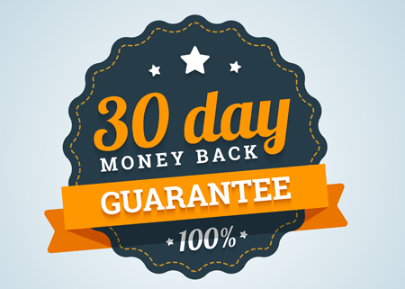
Ease doubts over a product's suitability by offering a 30-day money-back guarantee.
Ease doubts over a product's effectiveness by listing genuine customer testimonials.
Ease doubts that your product may be hard to use by offering tutorials and user support options.
5. Not everyone uses $s
Sometimes it's easy to forget that the world is a global marketplace. If you're an American company, offer your product in other currencies. If you're not an American company, make sure people can buy your product using dollars.
Exchange rates change every day, but the cost of your product shouldn't. If you retail at $299, your product should not cost £180 one day, and £178 the next.
People need to know the value of your product, and they will only really ever do that if you show them prices in their local currencies.
Don't forget to keep pricing simple.
6. Choice limitation
People tend to like to make decisions when the choices available are limited. When it comes to SaaS companies, the consensus of opinion seems to be to limit choices to four. This begs the question - how many of those SaaS companies actually tested this?
There was one company who had gone with the perceived wisdom and offered four different product plans. They decided to test with three and two. The two-plan version decreased conversions, but the three-plan version increased conversions by well over a third.
There's also the perceived wisdom that the correct number of choices to offer is between five and nine. The truth is, it depends on your business and the products and services that you are offering. The correct way to arrive at the right figure is to test.
7. Cash upfront is a great way to do business
The easiest way to run a business is to get the cash upfront. If you're waiting for the cash to come to you, you can't really commit to much just in case the cash doesn't materialize.
Your pricing page should offer rewards to people who are willing to stump up the cash now. It's a better way of doing business for both the buyer and the seller.
You need to be subtle though, as you don't want to alienate your customers who can only afford to pay in installments. If you offer a monthly payment plan, include options that say that if you pay the whole year in advance, you get two months absolutely free.
8. Be playful
The ecommerce side of the Web can be dull. You can add a touch of playfulness to your pricing page by letting people do the work themselves. They can adjust sliders to select their payment plans, check boxes to include or remove product features, and click on buttons to add discounts. You can add a little anticipation by having a "calculate price" button which pauses with the familiar "buffering" circle before the final price is calculated.
Playfulness creates the impression for people that they are in control. It is they who are deciding the price by playing with the sliders and clicking the various buttons, not you.
9. A clear CTA
The way in which your call-to-action (CTA) is phrased, and how it appears on the page, is important.
Avoid "BUY NOW!" or "COMMIT TO BUY!" If you order people about they'll get nervous. The final act should always be a two-step process, so the customer can be comfortable in feeling that they are always in control, and that the purchase will only go ahead when they are good and ready for it to do so. CTAs such as "Add to Cart" or "Proceed to Checkout" work well.
10. Let the customer keep control
You may have heard that the "Door Close" button in an elevator is only included to make people feel they are in control and not at the mercy of a group of electrical and mechanical systems. This is a myth but the principle of the so-called "placebo" button has been used in some circumstances.
It is true that people like to be in control of their destiny, as anyone who has ever lost their liberty will be happy to inform you. On your pricing page, you need to make sure your customer is aware of what happens at each stage of the purchasing journey. People hate to lose money because of a mistake, so if they're not sure what happens once they push the button marked "Confirm", then they are not going to push it.
Customers need to be made to feel confident as they complete their order. ALWAYS include a review stage - list EXACTLY what your customer is buying, and EXACTLY how much it is costing them.
"Please sign up for our newsletter"
It's a common tactic to include a pre-checked check-box at the moment of purchase that signs your customer up for your newsletter, or allows you to send them marketing messages via email on a regular basis.
Customers don't like to have decisions made for them. If there is an unchecked check-box then perhaps that is okay, but it's still a little bit of an intrusion. Your customer came to your site to make a purchase - they didn't come to sign up for newsletters and marketing emails, so in twisting their arm a little at this late stage you may damage the trust that you have just built up. Getting a customer to opt-in to your marketing campaign is always worthwhile, but that's something that is best left to happen naturally.
Don't forget to test
As is always the case, what might work for Peter, might not necessarily work for Jane. Never make assumptions, and don't get lazy and just ape your competitors. Find out what your customers want, and how they want it, and then test. Start with the simplest product presented in the simplest way, and build from the ground up.


