11 Inspiring (and appropriate) Logo Designs

Looking for some design inspiration? Keep reading.
Company logos are not to be taken lightly. They must quickly and effectively convey how we want consumers to view our brands. They must be captivating and attractive but understated. Logos need to be recognizable and adaptable, particularly on the Web. Most important, logos must be aligned with our business objectives. Often, consumers can get a good idea of the vision (or lack thereof) behind a brand simply by looking at its logo. If a logo is straightforward and effective, that might tell consumers that this is a no-nonsense business. However, if the logo requires some examination and creative leaps, it might indicate that this business takes a different approach to solutions than most. Either way, a logo must be brand-appropriate.
With all of that in mind, below are 11 different logos for 11 different types of brands. Each is an excellent example of not just creativity but the essence of a successful logo - linking a critical message to a brand.
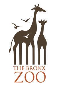
The Bronx Zoo (by Caroline Madigan, carolinemadigan.com)
New York is a big city with tall buildings. Giraffes are big, tall, exotic animals. The Bronx Zoo is in the heart of New York. Put it all together and you have a wonderful logo that tells you everything you need to know.
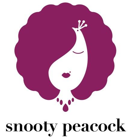
Snooty Peacock
Another animal. This time the peacock is used because of its elegance and uniqueness. The animal is framed expertly by turning its signature plumage into a chic woman's hair and the logo is finished off with subtle touches that immediately tell the consumer that this business is about exclusive fashion. According to their website, "Our jewelry is sought after by fashion forward women who want to be noticed for having the only piece of its kind."
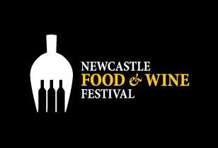
Newcastle Food & Wine Festival
What else would you expect from a food and wine festival ... than food and wine? And that's exactly what you get with this logo. The wine bottles are used to create fork tines and the use of negative space is superb.
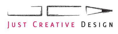
Just Creative Design
This logo is for a designer, Jacob Cass, who also happened to design the logo for Newcastle Food & Wine Festival. Cass' logo here is simple, elegant, effective and creative, all at once. The initals JCD combine to make a pencil, reinforced by the sketched look of graphite. This logo tells me the designer is creative, yet old-school enough to appreciate the simple pencil.
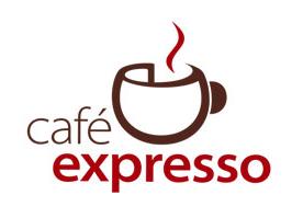
Cafe Expresso
There are many different sides to this logo. At first glance, you see a hot cup of coffee - which is want consumers want. Tilt your head to the left and you will see a three-dimensional "c" and an "e" as well, giving a very creative edge to the brand. And finally, the word "expresso" might be a clue toward this cafe's fast service. Or, it might be a misunderstanding of the word "espresso." I'm not quite sure, but I like to think that it's a creative way to indicate quick customer service.
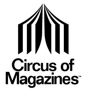
Circus of Magazines
This logo is for a website that lets users buy and sell new and used magazines. It is effective and simple, letting the consumer know exactly what they can expect - an olio of paper magazines.
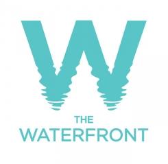
The Waterfront
This logo was apparently designed for an Australian apartment complex that, naturally, sat on the waterfront. It's simple and beautiful and does an outstanding job of showing land and water, right where they meet - the waterfront.
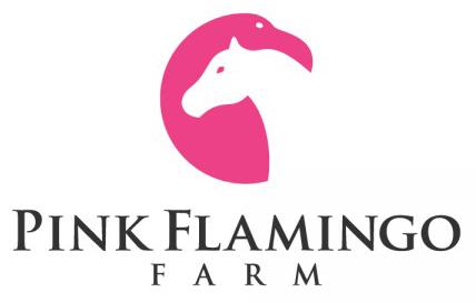
Pink Flamingo Farm
Again, more animals. Two very different animals this time, combined to make one logo. I like the use of negative space here to bring out the horse. While you might not think "flamingos" when picturing a farm, you do think "horses" - so this logo does a nice job of connecting its name to its product.
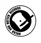
Bread and Butter Records
This is a logo for a small association of DJs who exchange and mix music. The plate, slice of bread and knife come together to make a turntable - a staple of the DJ profession, or bread and butter, if you will. My favorite part of this logo is that it was designed to be a sticker, too, that can go in the center of a record.
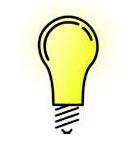
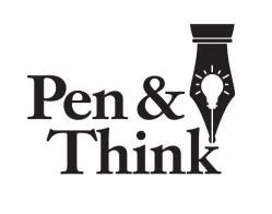
Pen & Think
This logo is for a freelance copywriter. The play on words should be enough to convince a potential client that this person knows his/her stuff. Add in the pen and lightbulb and it seals the deal. Like the pencil logo above, I like the hat-tip to tradition and values by using the fountain pen tip.
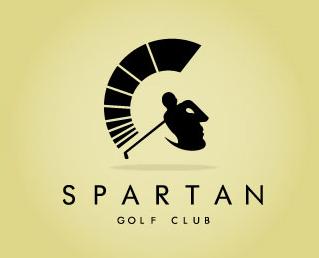
Spartan Golf Club
This might be my personal favorite on the list. What's immediately apparent is the golfer in the center, post-swing. Of course, very quickly, we can see the traditional Spartan helmet crest, then the face of the soldier and the rest of the helmet. The subtle part of this logo is in the crest itself. Segmented as it is, it resembles not only the arc of a golf swing, but a power meter often found in golf video games and tutorials.