
5 Surprising Sites Using Adaptive Web Design


The debate between having a dedicated mobile optimized website and one using responsive Web design has been alive and well for quite some time now. More recently, conversations and coverage around adaptive Web design versus responsive Web design began to take center stage.
With the help of Duda Co-Founder and CTO Amir Glatt, Website Magazine explores these two approaches to implementing multi-screen websites in-depth in our upcoming December issue. Until then, Duda, a DIY website builder for local businesses, and mobile and multi-channel technology company Usablenet, provide some top examples of sites using adaptive Web design.
Note, in the examples below, the URLs in the mobile browser shots do not change, one indication of an adaptive website.
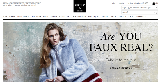
Avenue 32
Online luxury shopping destination Avenue 32, is a strong example of a retailer employing adaptive Web design for its smartphone and tablet Web experience. The brand, which features emerging as well as established designers, partnered with Usablenet to create a mobile and tablet experience that was seamless, intuitive and visually engaging. With a desktop site filled with content-rich pages including product images, designer details, curated looks and more, it was essential that the brand create a multichannel Web offering that was visually and functionally consistent with this desktop experience, according to Usablenet.
"Choosing an adaptive Web approach enabled Avenue 32 to spotlight its mobile discovery and commerce capabilities, allowing customers to better browse and shop on the go," said Carin van Cuuren, CMO at Usablenet. "And the success speaks for itself, with a 400 percent increase in smartphone and tablet orders, a doubling of mobile traffic, and average mobile transactions increasing by 270 percent."

USA Today
Offering an adaptive Web design, USA Today chose an adaptive approach, "because the technology allows the brand to detect the specific device by taking operating system and screen size into account to serve up a tailored experience." Thus, providing a richer news experience than responsive may have allowed.


Amazon
Similar to other sites using adaptive Web design (like CNN), Amazon encourages users to download its branded app. The Mobile Marketer, however, reports that Amazon is embracing adaptive design in order to deliver their sites on mobile up to 40 percent faster than if Amazon used responsive Web design. What's more, Amazon's adaptive site provides mobile users with the opportunity to use "Amazon.com Full Site" on their mobile devices, which some users prefer and responsive does not offer.


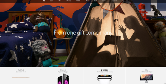
Apple
Known for its clean look - both on its website, in its stores and in its product design - Apple has been criticized for quite some time for not utilizing responsive Web design. After all, its smartphones are one of the main reasons responsive design exists. Today, however, its use of AWD means Apple.com will change according to device type and its functionalities.

About.com
A variety of news-type websites are utilizing adaptive Web design, like the aforementioned USA Today, as well as CNN, for its ability to load Web pages quickly and cater to all the different device types their readers are accessing the site on. About.com is no different, opting for an adaptive approach and not delivering anything that is unnecessary to the user.


Time, budget, audience and company stakeholders will undoubtedly influence a company's decision to use responsive Web design, adaptive Web design or a combination of the two, but ultimately those modern digital enterprises that are active in any part of the mobile debate are likely far ahead of their competition. In fact, a 2014 report by hibu indicated that 46 percent of small and medium-sized businesses do not have mobile-optimized websites at all.


