
5 Tips for an Optimal Online Shop Design

The ecommerce market is highly competitive. What should merchants consider if they are to beat their competition?
Nowadays, it can be challenging for online retailers to identify a genuine product niche. To make their shop successful they therefore need to find additional points of difference - its USP(s) or unique selling point(s). Particularly important in this context is what is termed the "buyer experience," which depends largely on an appealing shop design. Design trends can come and go - what's seen as trendy today can very soon start to look dated or tired. Below we highlight the design fundaments that have stood the test of time, and have a real business case to them:
1. Clarity of structure and messages
So goes the rule in online marketing that an audience should be able to receive the most important information from a Web page within no more than four seconds. Otherwise there is a good chance that they will simply leave and shop elsewhere. You should therefore ask yourself if the type of product sold in your online shop, as well as its USPs, can be picked up in a matter of seconds. To ensure this happens, your site should have a clear structure and send out clear messages.
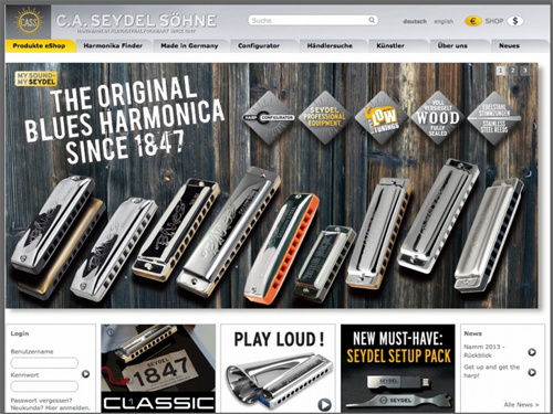
2. The more colorful your products, the plainer the shop design
Although this principle sounds rather counter-intuitive, it is one that is followed by most of the major fashion retailers. The focus lies squarely on the product photos, and a minimalist approach is taken to the surrounding design, which is often kept completely black and white. As a result, the customer's eye is drawn straight to the products - whereas a colourful backdrop would simply distract. Incidentally, brick-and-mortar shops apply the same techniques, so that you will very rarely see colorful clothes laid out on a colorful display unit.
With high-tech items and plain-looking products, of course, the opposite applies. In these cases, you should work with colors in your shop design so that your store creates a warm, inviting impression despite a lack of colorful merchandise.
3. The use of moving images has declined
Even just one to two years ago, virtually every site included rotating content sliders. However, recent studies have shown that content sliders can actually have a negative effect on conversion rates. What's more, they can also end up making some of the shop content less visible, as few customers will wait until three or four slides have scrolled across the screen. You should therefore rely more on separate static photographs with a clear call-to-action button that you change on a weekly basis. Four photographs over four weeks are better than four weeks with the same overloaded content slider. For example, for a special campaign, rather than including a content slider, simply use a static header graphic that clearly emphasises a discount or product hero.
4. Don't go over-board with content
"Content is king" - even if this phrase has become something of a marketing cliche, it still generally holds true. Even so, you should be careful not to burden your customers with copy that is simply too long. Instead, try to strike a comfortable balance between images and text and make sure you present everything in a form that is quick to process. The most important thing is to have one clear message and to let your customers see what you are offering right away. Where the copy needs to be a little longer, include the most important information at the very start, so visitors can review it quickly. They can then decide whether or not to read the rest of the text captions.
5. Mega menus allow fab navigation
Think of your online shop like the aisles of a supermarket. Shoppers getting lost or running back and forth is time wasting and damaging to your brand. To lead any visitor quickly and easily to where you wish them to go, a "mega menu" can be a highly effective navigation tool. Whenever users hover the mouse over a particular item in a mega menu, they will be clearly shown all of the subcategories below that item.
The benefit for your customers? In a conventional dropdown menu, users have to painstakingly work their way from sub-menu to sub-menu. This can easily turn into an annoying game of skill for visitors. With a mega menu, they can find the category they are looking for right away. Of course, the quicker they get to the product they want, the more likely they are to buy from you. Nonetheless, a mega menu is only to be recommended if your product range is sufficiently large and you need a category structure of at least three levels.
-2-1-1-1.png?width=500&height=184&name=megamenu_EN_2-(1)-2-1-1-1.png)
As Head of Corporate Communication for ePages, Richard Stevenson has been in the Web hosting and ecommerce software industry for around 13 years, many of which working directly with SMEs all over the world to drive Web adoption and awareness for e-business and ecommerce activities.

