
7 Tips for Designing High-Converting Landing Pages

Every designer wants their Web pages to "look good," but successful design is both aesthetically pleasing and purposeful. And, no Web pages are more important than landing pages, especially when it comes to lead generation. Landing pages can be homepages, product pages, sign-up forms and the list goes on. Landing pages are wherever a user is being sent to having clicked on a search result, an online ad or, even, a social post. They must be relevant, informative and, most importantly, tell a user what the company wants them to do.
Here are seven tips for designing high-converting landing pages, so these valuable assets starting working for you.
Don't beat around the bush
Websites are not meant for elucidating lengthy propaganda, on the contrary they only require precise business communication. Therefore there is no point in writing things that are unnecessary and irrelevant. The definite point should be made in clear, transparent and unambiguous terms so that it does not cross one's concentration span. Different font sizes and text highlighting tools can also be used wherever necessary but at the same time it should be kept in mind that too much usage of these text tools can become distracting and troublesome for otherwise smooth text.
Colors used should clearly stand out from one another
Designers should use contrasting colors to point out key takeaways and pivotal points to maximize readability. It's important to not use too bright of colors, as they can "vibrate" off the screen and make the copy difficult to read.
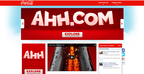
That said, choosing the right color combinations can result in a smooth highlighting effect (like Coke in the screenshot above uses different shades of red to differentiate sections of the landing page). Different color combinations can also work well on lengthy forms, as breaking up the form with different colors can make the form appear shorter.
Place the logo correctly
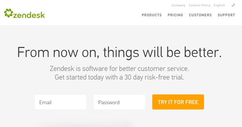
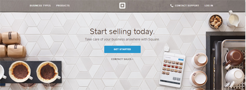
A reader's mind always follows a definitive scientific way which tells him to look at a certain position first before viewing the other (e.g. English-speakers read left to right). The logo should not proclaim itself too heavily but at the same time it should appear to be prominent enough. Zendesk (screenshot above) places it in the left-hand corner, which is where most users expect to see a logo. Square, however, places its logo in the center of its homepage, where it's noticeable but not obtrusive, yet definitely not the norm (see screenshot below).
Do not put too much visual
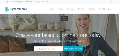
Placing visuals can be tricky as far as drawing attention is concerned. First of all, too much of not-so-well-placed images can result into a mess and a mess is undoubtedly an irritant for a user who does not want to put much of an effort to decode your idea.
Secondly, even if we assume that the visuals have been placed in a very decent manner, it may become counterproductive as the user will get lost into the attraction of images and you will never be able to communicate your genuine intentions to him.
Moreover, a page heavy with graphic images takes longer to load, which reduces viewership. Bigcommerce's image (screenshot above) is subtle, relevant and placed nicely.
Schematics of the page are not to be overlooked

Designers often get deluded by the "feel" of their designs and overlook the basic formatting of the page. This can vary from usage of proper font size to keeping the margin width uniform, proper arrangement of headers and sub-header across all the pages and so on. Stick to the basics and offer a simple design. It really pays.
Back up your claims
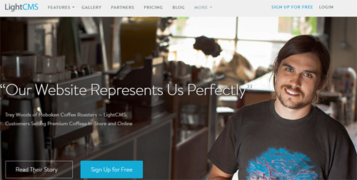
Most of the companies make very tall claims in their pages, which might not always be that close to reality. Whatever claims have been made should always be backed up by relevant proofs. Be it in the form of a client recommendation (like LightCMS does in the screenshot above) or photographs of success achieved or certificates of merit obtained.
Don't be fickle
To achieve converting efficiency from your landing page you should get rid of inconsistencies. Inconsistency in terms of formatting, placement of images or of any other type are a strict no-no as these create unnecessary jumps to the reader who quickly loses interest.


