
Best Web Design Trends of 2014

By Allison Howen, Associate Editor
Every year there are a variety of website design trends that take the Internet by storm.
While some of these trends end up being timeless best practices that are seen on websites for years to come, others will turn out to be fads and quickly thrown to the digital wayside by the Web design community.
To find the best Web design and develop trends of 2014, Website Magazine editors reached out to the digital design community (our readers and industry connections) to discover which Web properties were deemed most attractive, functional and generally impressive. Many of the nominations and submissions were deserving of a mention for the best Web designs of 2014, but the three featured below stood out from the rest by showcasing well some of last year's hottest trends.
Virgin America - Personalized Landing Page
Janrain data reveals that 74 percent of online consumers get frustrated with websites when content appears that has nothing to do with their interests. Fortunately, brands can remedy this problem at the very first impression by delivering a personalized landing page experience.
An example of a company embracing personalization is Virgin America. The travel company uses the tactic of personalization to provide a better experience to its customers, but more specifically, to streamline the ticket purchasing process. To do this, Virgin America automatically detects the location of its site visitors and uses the closest airport as the starting point for the visitor's travel itinerary (see Image A).
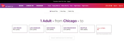
(Image A. Virgin America detects a user's location to deliver a personalized landing page.)
While there are a variety of solutions available to make personalization an easy feat, Baynote and AddThis are a couple worth checking out. Baynote, for instance, can be leveraged to match landing pages to a consumer's most recent search activity. Conversely, AddThis (which is typically known for its social sharing capabilities) recently launched an audience targeting tool that enables site owners to personalize their website based on a variety of factors, such as the websites the consumer has recently visited, the device they are using to access the site and their specific interests (learn more about this tool at wsm.co/audtarget).
Best of the Web?
Discover 5 more designs that deserve to be in the best Web design conversation at wsm.co/top2014design Jonathan Adler - Visual Navigation
When it comes to having a successful or unsuccessful presence on the 'Net, website navigation can be the determining factor. Websites that are not easy to navigate will frustrate consumers and increase the likelihood of site abandonment (pushing them closer to the competition).
Website owners must keep in mind that on-site navigation must not only be functional, specific and correct, but also intuitive so that visitors have an easier time finding exactly what they are looking for. One way to do this is by featuring images in navigation menus. These images should be easily recognizable and accurately represent a specific category or section of the website they redirect visitors to, as this enables consumers to get a better idea of the site's content with just a glance.
Take Jonathan Adler as an example. This home goods retailer features a traditional navigation menu bar across the top of its site. When visitors mouse over each menu category, however, they are presented with a more detailed slide down menu that displays an image to represent each category (see Image B).
While not a major departure from the traditional menu bar, the images do make it easier for consumers to digest the site's content and find the section they are searching for more quickly.
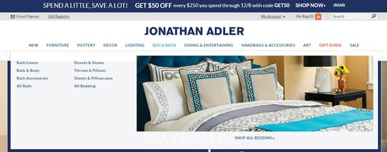
(Image B. Jonathan Adler features images within its navigation menu bar to make it easier for consumers to find what they are looking for.)
Reichman - Image-Heavy Design
Images are one of the most valuable types of content on the Web right now, and for good reason. Not only do images have the ability to quickly convey a story, but they also attract attention better than line after line of text. Because of this, many brands opted for image-heavy designs on their websites in 2014 (discover five retailers rockin' image-rich sites at wsm.co/imagerich).
Subscriber-nominated Reichman Sales and Services, for example, features a revolving carousel of high-quality and captivating images on its landing page (see Image C). In fact, these images make up about 90 percent of the site's landing page above the fold and do an exceptional job representing the website's content to new visitors. It is also important to point out that the site's minimal use of text compliments its image-heavy design and also help visitors learn more about the company without requiring them to read through a lot of information or click through to an "about" page.

(Image C. Reichman's minimal "use of text" compliments the site's image-heavy design.)
Trending in 2015
For most people, the New Year is a time to look back at the past and make resolutions for the future. In the tech world, this means that professionals like digital designers and developers will be sorting through the hottest trends of 2014 to figure out which technologies and tactics should be implemented and improved upon in 2015 and which should be thrown to the digital wayside with other technologies of yesteryear.


