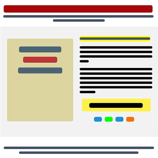
Designing Landing Pages with the Principles of Conversion

Today's customers are empowered and informed. Commercial websites experience a huge number of visitors of all sorts daily, but how many visitors actually become their customers?
The number is typically very low unless the landing pages are designed at an expert level. Somewhere the call-to-action (CTA) links get lost amidst the glossy page adornments or the links may take too much time to lead the visitor to the actual business page. Besides taming the basics of landing page design, developers must learn the dynamic principles of conversion to achieve sales goals.
Design-Based Elements
1. Encapsulation

Presenting products directly to visitors is as cold and boring like it sounds. Putting things in an interesting place on the page and leading the visitors there is a smart design approach. It is more fun to traverse through a visually appealing design and land at the actual CTA. There is also a psychological component, which comes into action here. When people see a wrapped gift box, they are more likely to open the box to discover what is inside it. So encapsulating the main content in a design that grabs the user's attention is an excellent approach to boost conversion rates.
2. Contrast

Some enterprises have conducted A/B tests to see which color works best for their CTAs. Sometimes, however, it's not the actual color but the contrast that is leading visitors astray.
Always consider the readability of the contrasting colors in use.
3. Directional Cues

Signboards showing directions to particular stores or restaurants are a common site on the roads. They are useful for leading people to things they are looking for. This concept of directional cues can be used in designing landing pages also. If used properly, these can usher maximum benefits in converting a large number of visitors into customers. The CTAs may have been placed somewhere on the page that the user may fail to notice. So, it is a great idea to use some arrows or geometrical patterns pointing in the direction of actual CTA. To ensure that the use of such directional cues does not backfire, the size and number of images should be chosen carefully.
4. Use of White Space
Leaving no white spaces on the landing page in an attempt to stuff the page with images and text is disastrous. It is very tiring to look at such a Web page for more than few seconds. The design should be soothing to the human eye and should not constrain the user to move away from the page. So leaving some white space in between content provids a delightful user experience and increases the chances of users staying on the page longer.
Psychological-Based Elements
1. Urgency and scarcity

Understanding human psychology and predicting people's behavior have always been at the heart of a successful business. When people see something available abundantly, they are less likely to make a hurried decision. The longer they take to make a purchase decision, chances are more that they do not buy at all. So, it is a smart idea to let the customers know what they are seeing now is available for few time only. It compels them to make a decision rather quickly.
2. Try before you buy
Everyone likes to make an informed decision while purchasing something online. It is more like giving the buyer a sample spray of the perfume to try before they buy it. When users can get a personalized experience of what they want to buy, it really boosts the chances of them buying it at all. Providing the customers with such 'Try before you Buy' elements also increase the credibility of the seller. The visitors are also more likely to buy things after they scrutinize the product.
3. Social proof
It is again about proving the credibility of the seller and product to the visitors. When people buy something, they like to seek the experience of customers who have bought that product or service earlier. So adding testimonials and positive user reviews on the landing page speaks a lot for the offers. Adding Customer logos and notes in the page strengthen the social proof the product, which promises a high conversion rate of the visitors.
Conversion goals of site owners differ from one another, but understanding of the basic marketing elements within Web design can help boost conversions in the short and long term.
About the Author
Rajesh Bhatia is the CEO & founder of NicheHype IT Services, a global IT consulting firm with expertise in delivering IT solutions. Bhatia is an experienced Unbounce designer.
Subscribe to Our Newsletter!
Latest in Web Design


