What makes design "flat"?
This question might seem simplistic, but it's imperative to have a working definition. While there are a few basic elements of flat design, the main differentiator is an absence of depth according to Les Kollegian, the CEO of branding and marketing agency Jacob Tyler.
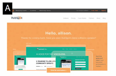
"When the Web first started and Photoshop came out, people were trying to use effects to make designs very intricate and create as much depth as possible," said Kollegian. "As time went on, the flat design components started to emerge and have been adopted, because I think consumers appreciate simplicity and ease of use." Designers are forgoing elements like drop shadows, bevels and gradients in favor of simpler, two-dimensional icons and imagery. This approach results in the absence of visual depth, but typography and vibrant colors serve as elements of interest. Take the HubSpot website as an example (see image A). The white text on the site's landing page stands out against the primarily orange background. All of the design elements have a purpose, and there is little distraction on the page. Plus, the site's "View the new features" call-to-action is not only cohesive with the rest of the site, but also lacks elements like shadows or gradients that could give it distracting depth, making it completely two dimensional and straight-forward.
Why is flat design popular?
Flat design has increased in popularity because it puts the focus on content, which leads to a better ROI. As previously mentioned, these often more simplistic appearing designs can improve the user experience, making it easier and faster for visitors to navigate a website to find what they are looking for.
"Unless you're on an entertainment site, it's really about going to a website to solve a task and flat design creates an easier approach to getting things done," said Kollegian. "I tend to believe that any time you are creating simplicity, it's creating an ease of navigation to go from step A to step B."
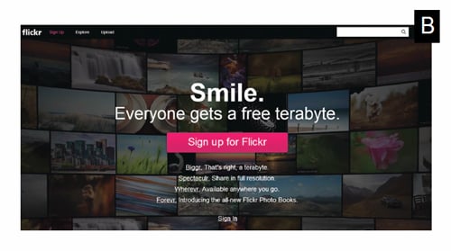
Kollegian also notes that the bright colors often seen in flat designs can improve usability, as they can help minimize distractions for site visitors by putting the focus on links and other navigation elements. Flickr's website, for instance, uses a dark background to highlight the white typography that is featured on its landing page. Plus, the site's most important calls-to-action are highlighted in bright pink, while the rest of the clickable links turn bright pink when visitors mouse over them (see image B). This helps draw visitors' eyes to the most important areas of the page.
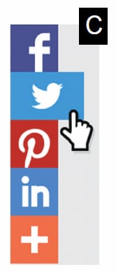
Flat design, however, isn't only trending on websites. In fact, it can be seen in nearly every type of creative nowadays, including within apps, advertisements and infographics. Recently, popular social sharing service AddThis unveiled a new, flat look for its product icons, calling them "modern" and "vibrant" (see image C). The update provides a few advantages for developers and marketers. For instance, not only do the new icons load faster on websites, but early testing found that they also foster 48 percent more clicks.
Flat designs usually have less weight than design-heavy sites, which means they tend to load faster both on the traditional and mobile Web. Because of the value placed on speed and fast-loading sites nowadays, this is another reason that flat design has been trending.
 Kollegian says that anytime his team is implementing flat design, they are usually also developing in responsive. This is not to say that responsive sites must feature a flat design, just that the minimalistic approach makes flat design adaptable, which helps developers offer a consistent experience across users' devices.
Is it right for my business?
There is really no correct answer to this question, as it is up to an enterprise to identify the preferences of its customer base. That said, Kollegian offers some advice to companies that are considering making a design change.
"Ensure that any design you create for your website is appropriate for your target market. Don't just design for the sake of following a trend," said Kollegian. "That's not to say this is a fad, but that you should always make sure your consumers are taken care of. If flat design is the way to go, then I highly recommend it."
If your team decides to commit to flat design, it is important to keep a few things in mind. First, teams should conduct competitive analysis to see how other companies have approached flat design. This not only provides the creative team with inspiration, but also ensures that everyone is on the same page from the beginning. In addition, creative teams should work to include only the necessary elements on a site, as too much content or needless imagery can distract visitors from completing the task they intended to complete. Lastly, as always, it is important to conduct testing (A/B, user experience) in order to discover which elements yield positive results (clicks and conversions) and which elements, well, don't. After all, flat design should enhance the user experience, not hinder it.


