
Emerging Trends in Web Design


12 Exciting Ways That Web Design Has Evolved
Web design neither stands still nor waits for technical innovations before evolving new approaches. The best Web designers observe how people interact with the interfaces they create in order to find what design approaches work best. And from several recent redesigns of sites, several design trends appear to be emerging.
1) Apple-Inspired Designs. Apple, one of the most creative and innovative companies in the world, has set a new standard for website usability. Its signature style (glass tabs and pale gray) gives sites the appearance of high-end quality. Designers have already made the floor reflection of icons a visual cliché. This trend started out in a subtle way, but has continued because Apple products and visual cues continue to attract attention from users. One example of an Apple-inspired design is Jeremy Koempel's Small Transport.
2) Rich User Interfaces. Improving the user experience is top-of-mind for most Web designers this year. This means the inclusion of more white space on pages along with responsive AJAX and Flash interactions that do more than just animate. The interfaces have intuitive visual clues that tell users when a button was clicked, by showing a pressed or shadowed look, or even including animation on the rollover state.
3) Huge Typography. Font sizes above 36 pixels in height and more expensive, non-standard typography give newer sites a more solid and customized look. Check out Web designer Francesco Mugnai's site for an excellent example.
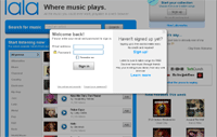 4) Modal Boxes or 2nd Generation Pop-Ups. These boxes, triggered by user actions, are built into rich-media sites and often darken the main window (such as the login on www.lala.com) until the user interacts with the second window.
5) More Flash Video. As broadband penetration continues, users can now view full videos in a more attractive and satisfying way without waiting for the video stream to begin. The big advantage here is you can entertain the user and quickly communicate your product or service. Keep in mind that some users might not have the latest Flash plug-in; make sure you provide an alternative video presentation for them. A good example of this can be found on TheStreet.com.
6) Carousels. This might be considered a variation on the Apple iTunes album browsing menu that was popular in the past. Carousels are essentially slideshows that rotate horizontally and are usually used to display photos or showcase portfolio work in a quick and easy way. Some carousels are information-based, so users can scroll quickly through news stories.
 7) Introduction Blocks. Because your eye scans a website beginning in the upper left corner of the page area, this zone is the most critical part of your landing page. So it makes sense to put your site's slogan or introduction here. Introduction blocks take up plenty of space (usually between 250 and 400 pixels) and are common to sites that offer a service or new technology. A good example is www.blubolt.com. (It also contains a carousel.)
8) Multi-Column Layouts. These are usually devoted to sites with a lot of content, making it easier for users to explore information in compact, short columns. More designers are using multi-column fixed layouts with wide grids of 1,000 pixels or more; these provide users with a brief overview of the content options surrounded by white space. A four column layout can be seen at labs.mozilla.com.
 9) Large and Vibrant Graphics. It's not just typography that's getting bigger. Huge illustrations, photos or textures are developed and used as backgrounds by many Web designers. Even the icons used for software products have grown bigger each year. Check out IconDesigner.net for a great example.
10) More White Space. One of the best trends in recent years is the increase of white space on Web pages. This is due in no small part to the sales of larger, wider screens and better Web design that allows site elements plenty of visual breathing room. In fact, unless your site is an aggregator of information like Digg.com, you can get away with almost as much white space as the classic Google design. Designer and Web developer Wilson Miner is a good example.
11) Social Media Icons. On today's blogs, you'll often have a hard time finding an empty space that doesn't promote the latest social icons beneath a post or alongside the related article links of the page. Twitter, Flickr and RSS feed icons are the most common.
![]() 12) Use of Real World Textures. Designers are adding more textures in the backgrounds of sites, and it looks like that old chestnut - the repeating pattern or logo background - is disappearing. From wood grain and brushed metal to a hand-carved look in the typography, it's a welcome departure from designs that only showed solid color palettes. Visit FishMarketing.net for a good example of using real world textures.
12) Use of Real World Textures. Designers are adding more textures in the backgrounds of sites, and it looks like that old chestnut - the repeating pattern or logo background - is disappearing. From wood grain and brushed metal to a hand-carved look in the typography, it's a welcome departure from designs that only showed solid color palettes. Visit FishMarketing.net for a good example of using real world textures.
Overall, the aesthetic of Web 2.0 dominates; you might remember those huge Comic Sans headers and funky Web visitor counters that were abundant a few years ago. But the more you look at these new sites, the more you see how much has changed. The era of CSS-based layouts is here to stay and today's Web designers are sticking with simplicity as the primary goal of site design.
About the Author: Aaron Kupferberg is art director and interaction designer for Didit and develops website audits based on user-oriented goals. Since 1996, Didit combines top-tier SEM strategy, highly sophisticated analytics and modeling, and best-of-breed technology to service more than 100 clients across all major verticals. Didit was co-founded by industry thought leader, SEMPO founding board member, and Didit Chairman & CEO Kevin Lee. Kupferberg can be reached at Aaron.Kupferberg@didit.com.


