
Head-to-Head Web Design RESPONSIVE VS. ADAPTIVE

By Amir Glatt, Co-Founder and CTO of Duda
When designing and building a website today, it's essential for enterprises to think about how users will access their website - will it be from desktops, smartphones, tablets (or all three)?
What's not as clear to many, however, is the best way to achieve this state of cross-device compatibility. Two of the hottest approaches to implementing multi-screen websites are responsive Web design (RWD) and adaptive Web design (AWD), but there is a lot of confusion about the two. While some consider RWD and AWD to be competing, they are, in fact, complementary.
What is Responsive Web Design (RWD)?
RWD is a design technique that results in websites being displayed properly on any screen size.
The main idea behind RWD is that the HTML markup sent from the server is the same no matter which device or screen is requesting the Web page. The only thing that changes is the CSS and Javascript code that formats the content differently according to the screen size using CSS media queries. RWD uses a fluid grid concept where content is split into rows and columns with clear "breakpoints" that determines when columns are "breaking" and are displayed in a new row.
The easiest way to determine if a website was built using RWD is to use a desktop browser and resize the browser window to the size of a smartphone screen. If the site reformats on the spot then you know this is a "responsive site."

Adaptive site in a desktop browser

Adaptive site in a mobile browser. Note that the URL of the site doesn't change in the browser address bar.
What is Adaptive Web Design (AWD)?
AWD is a technique to design websites that are optimized for the device, screen and the user by leveraging server side technology, CSS and Javascript.
In AWD, the server sends a completely different version of HTML/CSS/JavaScript to the browser by detecting the User Agent to determine if the request is coming from a smartphone or a desktop.
The best way to determine if a site is using AWD is by first checking that it is not responsive using the method outlined above, then accessing it from a smartphone browser (or using a user agent switcher) and checking to see if the site adapts to the smartphone without changing the URL in the mobile browser address bar (e.g. not redirecting to an m.domain URL).
AWD and RWD in Action
See five examples of websites that marry responsive and adaptive Web design at wsm.co/5awdrwd Which Approach is More Popular?
- RWD is by far the most popular approach today for building multi-screen sites and is much more known than AWD.
There are some good reasons why RWD became so popular:
- Designers only need to change the HTML/CSS of the site in order to implement RWD. Any front-end developer can do that regardless of which backend the site was built on.
- As a result of being so accessible, there were many ready-made responsive themes and frameworks developed. That spans from WordPress themes to CSS frameworks like Foundation and Bootstrap.
- Designers don't need to update their code when new devices are rolled out since responsive design only "cares" about the screen size and the "responsiveness" is achieved using CSS media queries.
- From a pure design perspective, designers typically don't need to think too much as the RWD concept is based on rows and columns in a grid with clear "break points."
The Advantages of AWD
While RWD is very popular, it has some drawbacks that AWD resolves. The biggest advantage of RWD is also its main drawback, however - the exact same HTML, JavaScript and CSS files are being sent to the browser in every use case. The more complicated a desktop site is, the more difficult it is to use RWD while still providing a good customer experience to mobile users. This includes both the performance and the design aspects.
Performance of the site deteriorates over mobile because every heavy JavaScript file a designer didn't notice when browsing from a desktop site becomes another 2 seconds of load time over 3G.
Design of the site also becomes problematic because it's often very difficult to take a complex layout designed for 1200 pixels width and adapt it using the same HTML to a 320 pixel smartphone screen.
With AWD, on the other hand, designers can send only what's needed to the browser in order to provide the best user experience. It can get rid of resources that are not needed and can make sure the HTML is optimized to the screen.
Another advantage of AWD is that designers and developers can think beyond screen size and add in other factors that the server can use when outputting the site markup, such as location, device capabilities and more.
It is interesting to note that most relatively simple websites like blogs, even popular ones are using RWD, while more complex sites like big news publications, and big ecommerce sites like Amazon and eBay are using AWD or a combination of RWD and AWD.
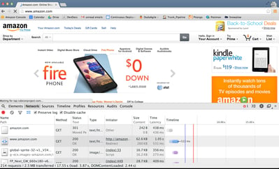
Amazon.com on desktop - 214 request, 2.5MB downloaded
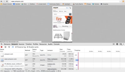
Amazon.com on mobile using AWD - 151 requests, 1.7MB downloaded
Combining RWD & AWD
Do these two approaches contradict each other?
Absolutely not. Websites can use RWD techniques and combine it with AWD whenever it makes sense. This approach can help designers and developers enjoy the best from both worlds - the simplicity of RWD when writing new content and knowing it will always be "responsive," while still optimizing the overall site layout and structure using AWD server-side scripting.


