
Keep Your Graphic Designer on a Short Leash

Let me tell you an inconvenient truth - your baby is ugly. Your landing page has severe and fundamental problems that are contributing to low conversion rates.
This is costing you a lot of money. To make matters worse, this predicament was completely avoidable. Worse yet, you have been a willing accomplice in your own undoing.
How did this happen?
You were led down this path by your internal creative team or outside interactive agency. Because of the limitations of their unique perspective you have been forced to sacrifice conversions in the name of "coolness." So, you have actually come to think that your baby is quite beautiful and have, in fact, grown very fond of it.
Let's take a look at the origins of this situation, and begin with the end in mind. The "end" should be fairly obvious - to have the most efficient landing page or process possible. This requires putting aside your own corporate and personal needs - instead considering everything from the perspective of your site visitors. Only they matter, and without them you would not have a business.
The key to effective landing page design is clarity.
The purpose of your landing page must be clear. The visitor should be focused on taking a simple path leading to the desired conversion action. This simple path should arise out of the Zen-like stillness of your landing page.
Worst Practices
Unfortunately, many landing pages are at the opposite end of the spectrum from this desired state. They are a visual assault on the senses, forcing the visitor to determine what (if any) of the many striking visual elements on the page are important.
Graphic designers are rarely trained in maximizing conversion. The best ones pride themselves on their ability to be non-conformists, and their ability to "think outside the box." They are bored with standard production-oriented graphic design work and like to keep themselves entertained by doing something new and interesting on every project. Unfortunately, the goal of the design is often lost, resulting in these chaotic landing pages.
Here is a short list of the more common visual transgressions found on landing pages:
Wild background colors - Many landing pages use dark and dramatic color themes. Often, large sections of the page or entire backgrounds are black or fully-saturated bright colors. These color choices often create a dark and brooding atmosphere, or imply something so exotic that it would only appeal to teenage male adrenaline junkies who play too many video games.
Garish text - Page text and headlines are haphazardly placed on the page and often use very large font in high-contrast colors. Font sizes are often enormous, and are further emphasized by the use of edging effects, drop shadows, color transitions and fades, and fill patterns.
Visual embellishments and flourishes - Even simple page elements such as box edges are emphasized with drop shadows, glow, or other effects. Simple round disks in bullet lists are replaced by colorful graphical checkmarks or other icons. A neutral background space to the sides of the landing page is often filled in with intricate patterns or photographic images.
Animation or video-All other design mistakes on the landing page pale in comparison to the aggressive use of motion, animation, and video. Images and text pulsate or revolve, image slideshows use wild fly-in transition effects, intricate animation sequences draw the eye, and full-motion video auto-plays on the page. These attention-grabbing tactics are very powerful. Unfortunately, they are rarely tied to the desired conversion goal on the landing page and only serve to squander a few precious seconds of limited visitor attention. Never deploy rich media on your page without first testing to determine its impact on conversion.
Case Study - CREDO Mobile:
Our client CREDO Mobile is a socially-conscious mobile phone company based in San Francisco. They donate a portion of all revenues to progressive causes - groups that CREDO members help select.
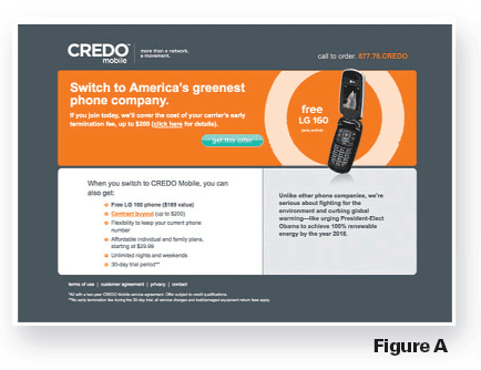
CREDO was interested in improving the performance of a landing page for a new e-mail campaign. The original page is shown in figure A.
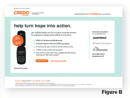
CREDO asked SiteTuners conduct an Express Review of their landing page in order to identify major conversion issues. After the review, they created a series of increasingly-refined redesigns that incorporated our best-practices recommendations and additional ongoing consulting feedback. The final landing page is shown in figure B.
The results were stunning. In a head-to-head test the new page performed 84 percent better than the original.
Why the radical difference? It can be argued that the landing pages are similar. Both show a single image of a phone and a distinct call-toaction button.
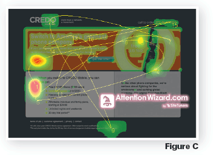
In order to answer this question SiteTuners employed advanced AttentionWizard.com attention-simulation capabilities. Using software and by understanding the way the brain and visual perception system works, it is possible to accurately simulate how a Web page will be viewed during the first few seconds of eye movement, and where attention will be focused.
The results are instant and do not require expensive eye-tracking studies, or page-tagging and time-consuming data gathering to create mouse-tracking heatmaps. "Attention heatmaps" can even be created based on in-progress visual mock-ups that have not been deployed as live pages.
The "before" page (figure C) shows scattered eye movements (yellow lines) that bounce all over the page. Drawn by bright blocks of color and sharp areas of contrast, the eyes do not find a place to settle. The colored attention heatmap likewise shows attention spread into many areas on the page. In the midst of all of the visual "noise" the green call-to-action button is lost and ignored.
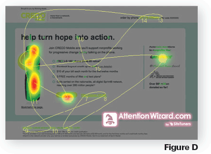
By contrast, the final page (figure D) shows controlled gazing focused on the phone, and the call-to-action button. After briefly scanning the logos of the progressive causes that CREDO supports ('social proof' that provides a 'halo effect' by association), the eye returned to the round offer call-out and the phone. The call-to-action button is one of three red attention "hot spots" on the page.
The moral of the story is clear: When it comes to landing pages, graphic artists need to follow a minimalist visual aesthetic that focuses on conversion and not window dressing. The new landing page may not be exciting visually, but that is not the objective. On a toned-down page the call-toaction emerges from the relative stillness of the page. "Boring" works. And it makes more money - that should make it plenty exciting.
About the Author: Tim Ash is CEO of SiteTuners.com, a landing page optimization firm that offers conversion consulting, full-service guaranteed-improvement tests, and tools to improve conversion. SiteTuners' interactive Express Reviews of a landing page can quickly identify major conversion issues. Ash is a frequent speaker at Internet marketing conferences. He is a contributing columnist to several industry publications and websites, and is also the author of the bestselling book "Landing Page Optimization."


