Less is More: Whitespace in Web Design

Most of us spend a great deal of time online browsing articles, shopping, updating timelines on Twitter and Facebook or doing a number of activities on social media.
It is critically important that the website content we are viewing is laid out in a clean, clear manner - and whitespace plays a prominent role in helping to achieve this aesthetic.
Opting for a simple layout will ensure your own website looks appealing to potential visitors - giving it a better chance of converting browsers into buyers and customers into advocates. Many people think that filling every single space with images, content and banners is the way to convince your readers, but they are mistaken. Too much content will make your website complicated and overwhelming, while putting off readers instead of drawing them.
Why Use Whitespace in Web Design?
Whitespace, sometimes referred to as negative space, is the areas of a Web page that are left free of any image or content.
Put it this way...if you write blog posts, then you certainly have a clear idea about the importance of whitespace. Breaking up content into small paragraphs and adding enough space between them is one of the key tricks of blog writing. Without proper spacing, people usually get overwhelmed and leave.
One of the most brilliant examples of whitespace in Web design is Google. The homepage is completely filled with whitespace, with no disruptions to draw attention away. The objective and design of the website is clear to visitors.

Benefits of Using Whitespace in Web Design
Not every Web design can be as simple as Google's, of course, so let's discuss the benefits of whitespace in Web design. But, first, let's understand that the term "whitespace" does not actually mean the white color to fill the space.
In fact, whitespace can be any color of your choice; the only purpose is to make the area free of elements. Here are a few advantages of using whitespaces:
Increase Visibility
When you start using whitespace to break up informative elements, it will improve the visibility and legibility of the website. Using short paragraphs, bullets and numbering will make a page more readable. People don't read every single word written on a website, instead, they can quickly grasp the information written in bullets, columns, numbers, headings and short paragraphs.

Improve Comprehension
Adding whitespace in your website content can really help people understand the message quicker and more clearly. Whitespace around content and images can increase comprehension to a greater extent.
Quality Boost
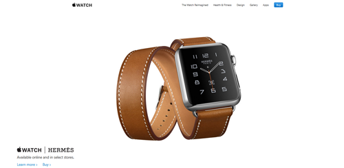
It is obviously not a coincidence that many famous brands use enough whitespace in their advertisements and websites. Think of all those luxury brands, including perfumes and other cosmetic adverts that you see everywhere on the Internet. They add lots of whitespace to shining the product brightly at the center.
This is useful for tech brands as well; the website of Apple is indeed a perfect example in this regard. Apple always focus on the visuals of their products as much as their proficiencies. The whitespace, they usually use in the website beautifully manages to showcase everything they want to peddle as being something desirable and deluxe.

Increase Focus
Adding whitespace is attracting an audience to certain website elements. By using whitespace between images, you can also increase focus on your marketing elements. It is particularly useful to cleverly add the empty space on many levels of a Web page.
Author Bio:
The blog has been penned by Saher Naseem (@SaherNaseemD), a creative writer, blogger and a social media addict. She is currently working as a brand strategist and content crafter at Dubai Monsters, a Dubai Web design agency specialized in Web designing and development, corporate branding and mobile apps.
Subscribe to Our Newsletter!
Latest in Web Design


