
Simplicity Rules the Day for LinkedIn Design Change

I suppose you could chalk it up to a crazy coincidence or merely to the fact that I was in a newsletter-reading frame of mind for a change, but for the first time since I'd begun receiving them some time ago, I read this morning's edition of LinkedIn Today that appeared in my inbox.
LinkedIn Today is the professional network's social news product which, in my case, appears quite randomly and usually receives a quick glance if it's not getting altogether ignored. But that wasn't the case this morning.
In fact, I opened the email, clicked onto the site, consumed several news items and, obediently completing all of the tasks a newsletter is supposed to invite me to do, poked around the site a little while longer and read some more content from the LinkedIn blog. If we were grading newsletters on their individual results, this morning's LinkedIn Today that landed in my mailbox would easily get an A+.
Imagine my surprise then, when I clicked on yesterday's post from the LinkedIn blog and began reading about the new redesign of LinkedIn Today. Senior user experience designer Joann Wu writes that the goal was to "not only make the product easier to navigate, we've completely re-imagined the look and feel so you can get quicker access and customized ways to consume the news that matters most to you."
She continued to say that, "One of the key design principles that drove the approach for the visual change was to simplify the experience; creating an elegant, delightful and customized experience for news consumption."
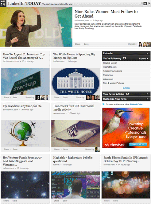
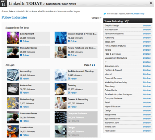
The simpler user interface shown below perfectly combines images and text to create a blocky grid-like layout and makes it exceptionally easy to scan content. The new interface also emphasizes the user experience by making it easy to share articles with your connections throughout the LinkedIn network, and to see which connections are following and sharing certain items. Users can also customize what kinds of stories they will see with the Customize Your News tab, also shown below.
But come on, that seems like a pretty big coincidence to me. The first time I choose to engage with the product happens to be the first day I receive the completely overhauled, redesigned version. And I didn't just skim it, either - you could say that I vigorously consumed the darned thing before spending 30 more minutes of my morning on the LinkedIn site.
And there's that word again: simple; or, in this case, "simplify the experience." Clearly, that's what my subconscious mind was waiting for, a simplified social news experience from LinkedIn. And, really, that's what all of us as Web users demand today, simplified experiences in the form of simpler, user-friendly designs. Bing's de-cluttering of its search results pages is just one of thousands of examples in the very recent past.
Whether my experience this morning was a coincidence or not, it is definitely not a coincidence that LinkedIn Today received its new look barely two weeks after the launch of the professional network's iPad application. The app is simple and sleek, which is the look the news feed now has, "creating an elegant, delightful and customized experience for news consumption."
So, for LinkedIn, a smart move on their redesign that, if I am any indication, should serve the company well in the future. For the Web design community, just more irrefutable evidence that simpler design is the course we are on and the direction in which we are headed.


