
MSN Jumps Aboard the Redesign Bandwagon


Several major media properties have undergone redesigns within the past year or so; including a handful of Tribune properties, CNN.com and ESPN.com. Now you can officially add MSN to the mix. And all of these redesigns share some commonalities; including simplicity, clean design, bright and large imagery, and a focus on the user and their evolving Web savvy.
Let's take a look at some of the changes. The top image is the old MSN.com and the bottom image is the new redesign. What you will notice first is the addition of white space, or the removal of MSN's trademark blue, depending on your view. Immediately, the site feels much more relaxing and easier to scan, much like the redesign of the LA Time's website. "MSN blue" has not disappeared entirely, however. You can still see it above the Bing search bar, between page sections, and outlining tabs. And speaking of tabs, many redesigns are switching from simple links to a tabbed browsing style. This makes it much easier for the reader to understand where they are on the page. It also limits downward scrolling -- something of which advertisers should take notice, when considering ad placement above or below the fold.
A few more observations: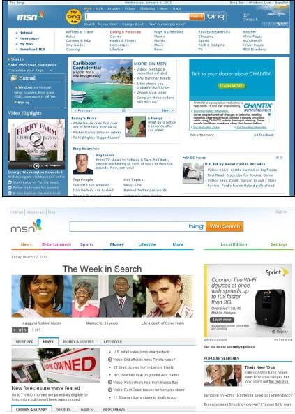 Images are huge -- figuratively and literally. Every redesign these days includes large, bright images to capture the user's attention and entice a click. MSN even uses a slider, something traditionally reserved for blogs. However, MSN is known much more for entertainment than news, so the slider is appropriate. Either way, websites are evolving to reach out to the user, instead of forcing the user to dig for what they want. On that note ...
Links are fewer. Again, like the LA Times, the amount of links has been drastically reduced. Above the fold, the new MSN design has about 37 different places to click. The old design featured more than 60 clickable links. Fewer links not only makes the page easier to read and digest, but also focuses user attention on important parts of the page.
Blue links are dying. We saw this trend with the LA Times' redesign. On many websites, traditional blue links are being phased out. Web readers already know that just about every headline is clickable. Instead, text is now being formatted to better fit the look of the website and to not distract readers from their scanning behavior.
Online video is ubiquitous. On the old MSN.com, you will notice a section to the left titled "Video Highlights." There is direction for the user ('click to play') and the video is framed in a video player. Today's Web user is intimately familiar with online video. Now, the only indication of video is a simple "play" button - either on an image or next to a link itself. You will also notice that video highlights are integrated with regular, text links. There's no stronger indication that video is expected and demanded by users. It is no longer a luxury item.
Airing it out. As mentioned previously, MSN now has much more white space. And they are not the only ones. Most redesigns are headed in this direction. The focus is (as it should be) on the user. Web pages are becoming easier to read and less chaotic. The availability of information online is forcing websites to rethink how they deliver that information and to make the user experience comfortable and inviting. When you look at the old MSN, it resembles search engine results. The new site is a destination.
Thinking about a redesign? Don't miss Website Magazine's upcoming May edition, where we address the criteria and strategies of a website redesign.
Read about CNN's redesign (where we talk about some below-the-fold issues) and the LA Times' redesign.

