
Responsive Design Templates to Check Out


 Template Monster, a provider of design templates for use on websites, blogging platforms, content management systems and Facebook layouts (to name a few), announced that it has released several new "responsive" design templates.
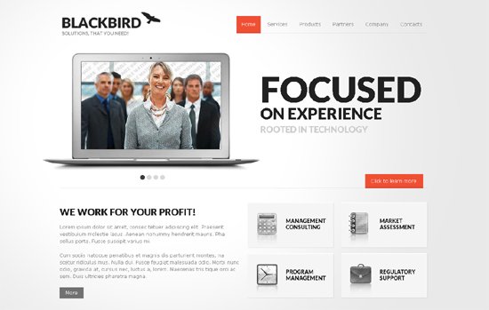
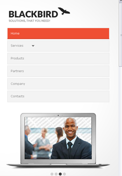
Responsive design in short means that the website adjusts to the different types of screen resolutions, adapting to the device people are using to view them. This is typically achieved through the use of CSS3 media queries. There are many width options included in the Template Monster templates but the major (most important) ones are for desktop devices, tablets and 2 sizes of smartphone screens.
Check out some demos - here, here, and here. By simply adjusting the size of the browser window, you can see the modified, responsive layout. Below are a few examples - one full screen browser window and one adjusted window. Try it out for yourself and you will quickly see how responsive design is now the de facto way to optimize for both the mobile and tablet experiences of users.


