
The LA Times' User-Centric Redesign


Newspapers, by and large, are beginning to embrace their online readership rather than fight the transition. Nowhere is this more evident than the recent redesign of the Los Angeles Times' website.
What stands out immediately is that it looks like a blog. In fact, it looks a lot like any blog you might read from just about any blogger.
Then there's this, from Meredith Artley, managing editor, online, about the new look: "We're breaking more news than ever on latimes.com; we've expanded our blog network; we're publishing more stunning visual, interactive journalism; and we have savvy readers like you contributing to conversations."
Blog network? Interactive journalism? Contributing to conversations? Has the LA Times gone mad? Not exactly. What they've done is taken a decisive step toward becoming a news source focused on the user, not so much old traditions or dare we say - advertisers. Let's examine some of the design changes by comparing to The New York Times, and see if we can't learn a thing or two. For now, we'll concentrate on items and layout above the fold.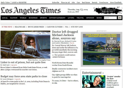 LA Times
- Just about every critical piece of information is above the fold - links to each section, links to subscribe, to place and ad, and jobs, and a few key stories.
- The lead story photograph is large and inviting.
- There are about nine stories above the fold and just one advertisement. The reader spends less time scanning the page for what's important.
- Headlines are large and easy to read and so are the descriptions. In fact, the descriptions are brief enough that it's easy to decide to scroll down and explore more of the page. The font has changed to a serif from sans-serif.
- Lots of white space. The site feels very uncluttered - white space is evident even between the stories.
- Limited click options. There are approximately 37 places to click above the fold, not including drop-down menus.
 NY Times
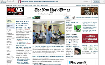
- Compared to the LA Times, this site is downright chaotic. It's difficult to determine exactly where I should start looking first.
- There are five advertisements above the fold.
- Blue headlines compete with black text, adding to the confusion on the page. Traditionally blue means a clickable link, but it's doubtful these days that anyone would think a headline is not clickable.
- Numerous click options. Approximately 75 places to click above the fold - double that of the LA Times' site.
After the click
- Click a story on the LA Times and you are taken to the story. Click on The NY Times and you're led to an interstitial ad, with the need to either wait or click to be taken to the story.
- Interactive options on an LA Times story include a ShareThis widget, e-mail and print, and the ability to change text size. The NY Times forces a user to sign in to the website before e-mailing or "recommending."
Clearly, the focus of LA Times' redesign is user-friendly usability. They have made a bold attempt to connect with a more Internet-savvy audience. And by doing so, they have actually made the site more inviting - encouraging site exploration, which means exposure to more ads than just the one above the fold.
Proof will come later, as the design takes hold with consumers - or doesn't. For now, the move looks absolutely user-focused. And that's a good thing for everyone, including advertisers. After all, happy readers come back and start clicking.

