
The Problems With Parallax Design

Design elements that seem like a great idea at first might cause some pretty serious issues later down the line. That's exactly what happened with iOS 7 since it launched late last year. With it, Apple introduced several design techniques including fake zooms, parallax scrolling, sliding and more. The animations essentially create a more flashy and attractive UI through the use of visual effects.
Unfortunately, none of these features were included in the previous version of iOS and the upgrade ended up being pretty unsettling to conventional users (many of whom are still using iOS 7 after an embarrassing iOS 8 update). A few folks that deal with motion-sickness found they have difficulty using the new OS and updated devices. This is not something you want associated with your software or overall design.
While the other design elements are also responsible for some of the issues in iOS 7, the biggest offender is the parallax design. Parallax design and parallax scrolling has become incredibly popular over the last few years, especially in the world of Web design.
Debunking the Technique: What is Parallax Scrolling?
Parallax scrolling is a design technique that became popular around late 2012. Of course, it was being used earlier than that by developers, but that is around the time it was more widely adopted. The concept was originally created for the video game industry to be used as a "special effects" technique. It allows an image or Web page to appear as if it has depth to viewers thanks to an optical illusion. Traditionally, that meant using multiple backgrounds all of which scrolled at different speeds in order to simulate page depth.
More recently, the term has been associated with single page websites that "look cooler" thanks to scrolling images and visual effects (see image below and click on image to visit website). In a way, the concept has evolved to become something entirely different over time. Although, the modern association of the term that refers to single page websites is not technically parallax scrolling.
That said, it's a common misconception that the technique is easy to implement, or that it adds to the overall usability of the site. Yes, in some circumstances it can improve a page's design but that is an exception more than it is the rule. In light of that, we're going to take a look at a few reasons why parallax scrolling is no longer desirable for modern site designs.
Excess Animation Can Be Distracting
In most cases, animation and visual effects such as parallax scrolling are used to make a site look better. While these elements can make a site more attractive, they can also be distracting. Even worse, parallax design will lower performance depending on what device(s) viewers are browsing on. Sure, top of the line smartphones will display effects and animation just fine but not everyone is using them. As a designer you have to think about your entire user base, not just a small portion. You want the site in question to work properly for everyone.
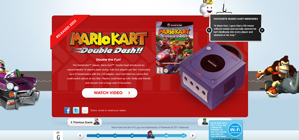
In the case of animation and visual effects, especially with parallax scrolling, less is more. A great example of this is the Nintendo Australia website for Mario Kart. You can see how they used parallax scrolling in the background to give the page more depth, but the entire layout includes way too many distracting elements. As a result, your eyes bounce around the page when it first opens, because there's no central focus in the design. The website's designers would have been better off skipping the parallax background and including a more traditional one.
Parallax Design Will Hamper SEO
To be perfectly honest, who doesn't rely on SEO these days? If you happen to be one of the few that doesn't, you should probably take a moment to read about it and understand why it's so important for modern design.
The greatest benefits of SEO come when a site has been developed from the ground up around the concept. Unfortunately, that's where parallax scrolling causes some serious issues. It will undoubtedly hamper SEO.
The technique detracts from SEO for several reasons. Those include multiple headers on a single page, slower loading times, lower browser compatibility ratings, and a lack of mobile device support in some circumstances. There are a few workarounds and solutions to these problems, but for the most part you need to understand that with a site using parallax scrolling your SEO is going to take a hit. SEO is so important for a website today that it's not worth the setback.
Small businesses and sites that rely on geo-targeted search results should never use parallax design. This is because it will ruin organic search rankings, resulting in quite a few problems such as fewer customers discovering your local business.
Parallax Design is Not Easy to Implement
It's a common misconception that responsive designs, or those that would use parallax scrolling are easier to put together. That's not true at all, because they require a completely different development approach. Traditional websites work more like a flow chart, where you must map out all of the different roadways. All you need to start development on a traditional site is a simple plan or blueprint of sorts. In addition, content can be improved and added to the site as it comes together.

(Check out Spotify to see how viewers "flow" through the site.)
Parallax design relies heavily on a single form of navigation. In other words, viewers are simply "flowing" through the site following the narrative the designers have created. This means, the site has to be planned out in full beforehand and the content also has to be put in place then. It is much more difficult to make subtle changes to the design or flow of the site in the long run. It also puts more responsibility on the site owners since they will have to generate most - if not all - of the site's content up front.
Stay Away from Parallax Design
Even though Parallax Design has gained popularity over the last few years, and was used by Apple in the latest version of iOS, that doesn't mean you should rely on it for your own design. In fact, it shouldn't even be considered "fun" to use anymore - it never should have in the first place. It may spruce up a site's aesthetics sure, but it's a hassle to implement. Furthermore, your site will likely take a hit to SEO and viewers may have a hard time focusing on what's important, which is the main content. In other words, don't use parallax design techniques for your website. After all, you don't want your site to end up like iOS 7, resulting in discomfort for your viewers. That's not to say you shouldn't rely on a responsive design however, but that's a different beast entirely.
Briley Kenney Bio
Briley Kenney is a self-proclaimed wordsmith climbing his way to the top, one article at a time. Currently Briley writes for publications such as TemplateMonster, WebpageFX, SmartWatches.org. Recently, he served as a valuable member of the Little Killerz dev team producing in-game content for Tales of Illyria Episode One and Two. The team is currently working on the third game in the series. You can check them out on Google Play.


