
Flat Design: Past, Present & Future

If 2012 was the year of big background images and parallax scrolling in Web design, 2013 could easily be the year of flat design.
While some think this style is clean and compelling, other think the "trend" will die fast. Website Magazine interviewed our own Creative Director Jesse Erbach to get his thoughts on the past, present and future of flat design. We also included 10 stellar examples of the style in action.
What is flat design?
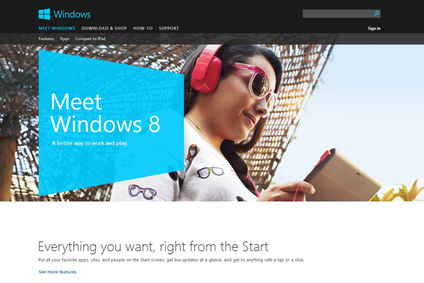
Website Magazine Creative Director Jesse Erbach: Flat design is a design trend that started a very long time ago but became popular with the introduction of Microsoft's latest operating system, Windows 8. It is also referred to as 'Metro' theming as this methodology of style was reborn as a result of the design communities mass acceptance of Microsoft's new user interface design principles (deemed the 'Metro' style by Microsoft PR).
Flat design is a focus on function over form. It centers around focused use of typography and 'clean design' (better explained as an uncluttered design solution with very clear visual instructions). The primary hallmark of this style is a focus on user experience as a result of clearly defined goals without unnecessary visual embellishment. Flat design can be easily identified by a lack of gradients, tight color pallets, a focus on typesetting and large amounts of white space.
Why do I like/dislike this design trend?
Erbach: It focuses on the user instead of wasting time with unnecessary details that might distract from the goals of the project. It represents a return to a focus on good user experience as the ultimate goal of a design instead of just making it look pretty.
However, what I don't like about this design trend is its sometimes overly aggressive stance against embellishment. This can at times result in designs that are almost distractingly plain.
Do you see this trend continuing into 2014?
Erbach: This trend will very likely carry on for some time. With the introduction of iOS7 this month (Apple's new mobile OS) and its strict adherence to the flat design principles, I don't see its popularity waning in the near future. That said the trend will not remain exactly as it is now. We can already see some mutations to the current flat design principles, taking place. Adding subtle shadows to 'flat' themed images/buttons being one popular design trend.
As time moves along I expect to see quite a few additions to flat themes to support a move from the absolute bohemian plainness of its current state to something that is both UX focused and that has visual fidelity. In web design, we will likely see greater emphasis on movement (via animation/transitions) and javascript for use in design elements then we had in years past. In print design, we'll likely see the flat trend continue as it has with a few subtle trends as time moves forward.
10 Flat Design Examples
1. Karma

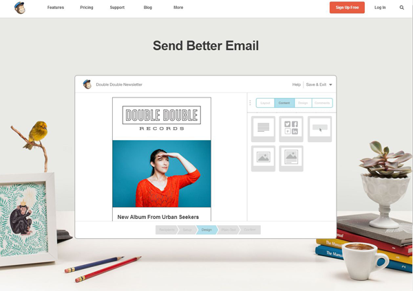
2. MailChimp
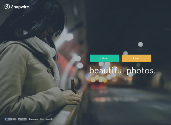
3. Snapwire
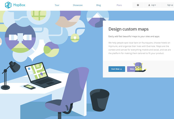
4. MapBox
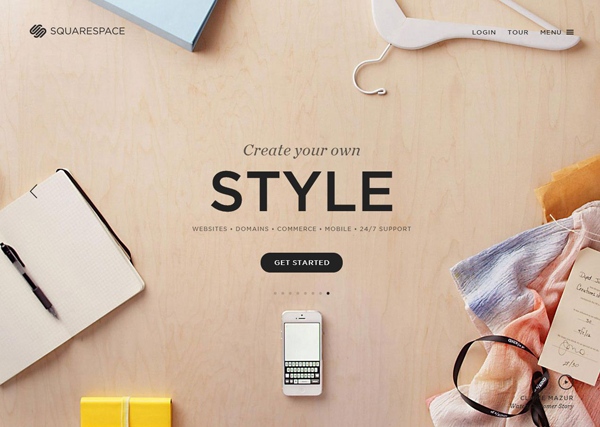
5. Squarespace
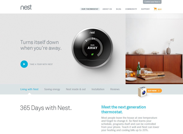
6. Nest
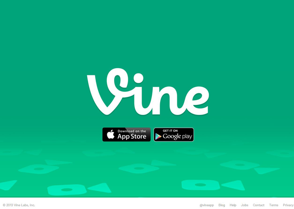
7. Vine
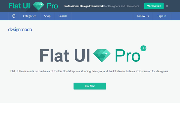
9. Designmodo
10. Microsoft Windows (Of Course)
Please tell us what you think of flat design in the comments below!


