Five PPC Landing Page Design Trends


If you are paying for clicks, you must ensure that the landing page where consumers end up post-click can convert. Impressions count more than ever when it comes to PPC landing page design so let's review what sites are doing right (and wrong) and perhaps even find some inspiration for our own PPC campaigns and the landing page designs they feature.
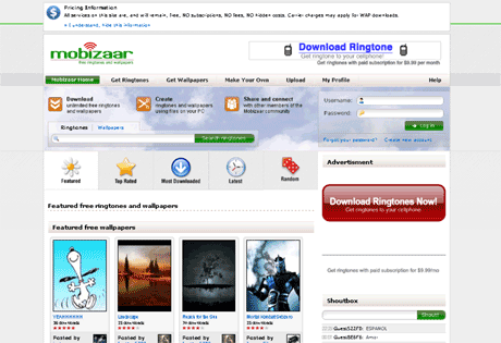
When you want to analyze what works best in PPC landing page design, you want to start with the most competitive terms. We took a look at ten landing page designs (only nine are featured as one was was ultimately just a parked page) to determine similarities and differences that the design concepts have. You might end up applying some of the techniques on your own site, but before settling on one, remember that testing is the only sure fire way to ensure that the right elements are available to convert your specific audience of consumers into buyers.
The keyword in focus (and of course the landing pages that result) are under the keyword "ringtone". Clearly our choice of keyword will influence the type of landing page designs that resulted. Expect the sites that bid on those terms to focus on acquiring a younger, more socially-connected, technology savvy audience.
There are a few core trends which revealed themselves by comparing multiple PPC landing pages. The sites listed below are in the order in which they were found on the results pages. Once we can determine what's going on with landing page design, we're able to make informed decisions and perhaps even understand how to influence the quality score of those individual listings.
Trend One: Limited Paths For Users
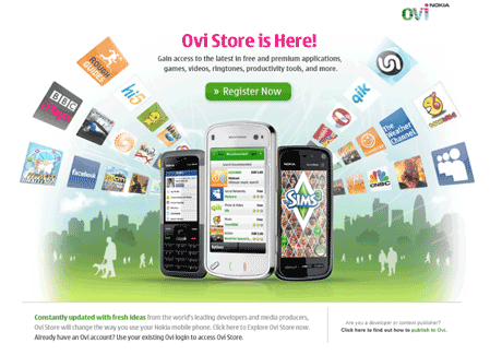
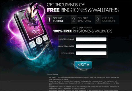
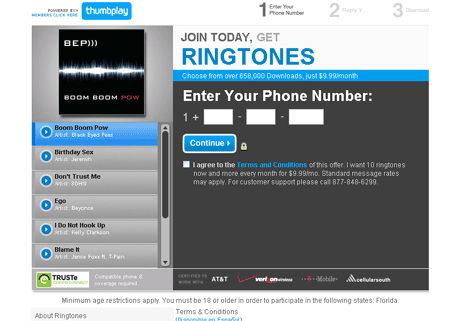
Common among the first five listings are the limited paths users can take when arriving on the landing page. Ovi Store by Nokia (which occupied the first position during our review) had just three options: register, login, and a call for developers. FreeRingToneLocker, CellWare and ThumbPlay took a similar "less is more" approach (see trend four for additional information).
Trend Two: Prominent Images
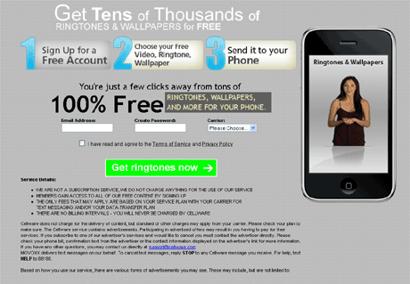
The next trend is the prominent use of large images. In fact, on the landing pages of the first two listings this was the core design element. CellWare (within the third position) took the use of a prominent visual a step further by including a video of a young attractive woman presenting information on the offer.
Trend Three: Strong Call To Action
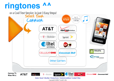
Several of the top five listings (Ovi Store excluded) had a clear value proposition presented that was coupled with a compelling call to action. For example, ThumbPlay's "Join Today, Get Ringtones" is a straightforward statement, leaving no doubt in the mind of the user what they need to do to get what they came for. Tonefor.Me is using dynamic keyword insertion on their landing pages coupled with a static call to action.
Trend Four and Five: Data Collection, Content Teasing or Registration
We've decided to combine trends four and give into one, but it's the most important of the group. The sites we reviewed leverage three very different conversion tactics. While some required registration to proceed, others either focused on a basic data collection (name and email) or what I refer to as content teasing.
What I find fascinating about conducting a review of this nature is the insights that a basic study such as this might reveal about quality score. What other design trends do you see on these sites and how do you think this influences quality score? Comment below now and share your thoughts with Website Magazine readers and editors.