Ghost Buttons in Focus (Sort of)

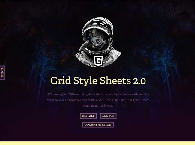
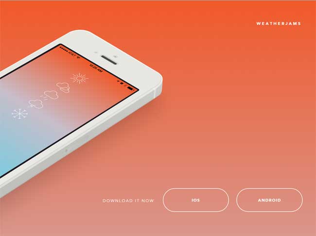
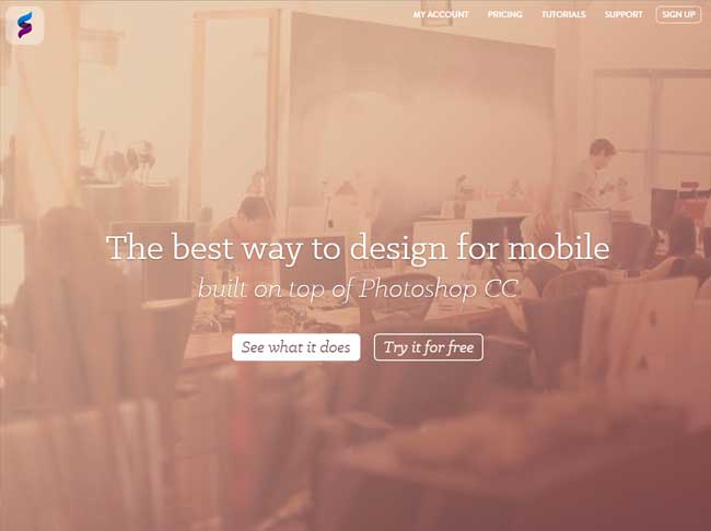
There's a somewhat disturbing trend in the Web design space today - using ghost buttons, those transparent, empty-appearing buttons that take on a common shape (like a rectangle) but are bordered only by a thin line, and use the page background as the color fill of that element.
Most ghost buttons typically have some sort of mouse over effect (achieved through some jQuery or simply via CSS), but des their ability to fit so seamlessly into the minimalist designs so popular today negatively impact user interaction, engagement and ultimately conversion?
The only way to know for sure if the presence of these ghostly elements are effective of course is through conversion testing, but for many their use will be in direct opposition to what they understand about design optimization, where call-to-action buttons are meant to stand out and forcefully (yet sublimely) push or pull the user deeper into the digital experience of the website.
Are ghost buttons a good idea for your website? Take a look at a few examples and share your thoughts below with a comment!


Subscribe to Our Newsletter!
Latest in Marketing


