
2 Winners & 2 Losers of Big Brand Web Design


With all the website traffic big brands get, you'd think they'd be chomping at the digital bit to provide a seamless user experience, from mobile and omnichannel features to advanced on-site search and filtering.
Web designers - and even everyday shoppers - however, know this isn't always the case. In honor of the upcoming holiday shopping season, Website Magazine put together a quick list of some winners and losers of big brand Web design.
Winners
Carter's
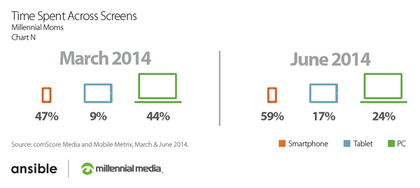
As one of the only top 100 retailers to offer a responsive website, Carter's caters to its mom demographic perfectly. Research from Millennial Media shows that U.S. millennial moms (ages 18-34), in particular, are an active, dominant, mobile-savvy group of consumers who use multiple devices along the purchase funnel. In fact, since 2013, the number of millennial moms who own smartphones has risen from 78 percent to 85 percent. Carter's is smart to leverage responsive Web design as it supports today's cross-screen moms (see chart).
Additionally, Carter's incentivizes its shoppers right away on its homepage with its sale copy. What's more, Carter's offers various ways to navigate the site to easily find the size and style appropriate to that user's needs (e.g. baby girl, toddler girl, etc.).
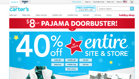
(Carter's full desktop site)
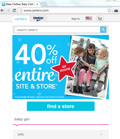
(How Carter's looks when minimized for various screens)
Home Depot
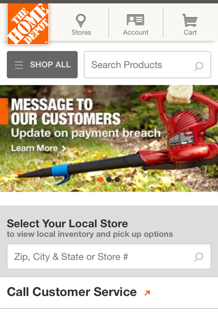
While not responsive, Home Depot does offer a mobile optimized website that puts an emphasis on location. There are two different places on its homepage that offer the ability to find or select your local store (mobile screenshot below). This is important because Home Depot's local stores provide an advantage over Web-only retailers, as "convenience" is often stated as a reason for shopping in a brick-and-mortar location rather than online, as consumers get their products faster. What's more, consumers act quickly after they search for location information.
On the desktop site, users are also given the opportunity to set their local store to maximize their HomeDepot.com experience. Using the Web visitor's location allows Home Depot to check store inventory, pick up in store options and more.
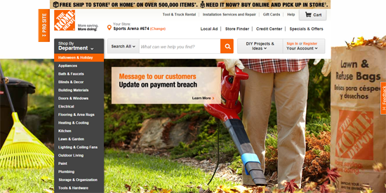
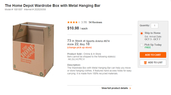
These options are one indication that Home Depot is truly embracing omnichannel retail, while another indication is through its aisle finder feature. When users view an item (as shown below), the product page tells them what aisle they can find the product in. This reduces customer anxiety and likely increases conversions. Aisle411 is one indoor-mapping software that can help retailers add this functionality on their sites and drive in-store visits and purchases. It counts Home Depot as a client, as well as Walgreens, WinCo Foods and more.
Losers
Living Spaces
A provider of affordable and stylish furniture (very popular in the Southwest), Living Spaces can do a lot more with its website, starting with filtering options. When users select, Coffee & Side Tables from the main navigation, for example, they are given no filtering options. They are given, however, sorting options (e.g. reviews, cost, etc.), but aren't able to filter the dozens of options by color, size, material, etc. What's more, Living Spaces provides no way to break up the very long page into, for example, grid view, 10 selections per page, etc.
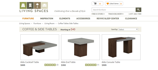
Living Spaces does use breadcrumb navigation to show users how they go to the page (Living Spaces, > Furniture, > Living Room, > Coffee Tables Side Tables), but the user experience would certainly be improved with filtering and viewing options. The task of finding the piece of furniture a user wants becomes more cumbersome as the number of available products increases.
Living Spaces does not use responsive Web design, but does offer a mobile optimized website that has click to call (certainly a mobile best practice) and store locator options (another mobile best practice). Its mobile website is powered by Mad Mobile.
American Apparel
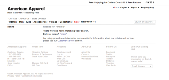
Sept. 2014 research from IAB found that 1 in 5 top fashion brands lack a mobile optimized website, American Apparel is one of those brands. Aside from this "mistake," American Apparel could also improve its on-site search, as it returns a no results found error page. While American Apparel does include a "did you mean" option (which can keep a user on the site), it could make its search results "stickier" by showing similar products or using auto complete to reduce the chance of this error from the beginning. SLI Systems and Coveo both offer smarter on-site search.


