5 Companies Proving RWD Increases Conversion

Digital professionals know that the way people are using their mobile devices have gone beyond making phone calls, typing text messages, and sending emails. Nowadays, smartphones and tablets have become the latest means for shopping and socializing.
Savvy brands have long recognized the importance of a mobile-first strategy, but Google's algorithm update has given greater urgency to those ecommerce businesses who have yet to take the mobile plunge.
The latter needs to quickly integrate online and offline marketing campaigns; they need to reach out to the massive market of mobile users and make sure that these people can conduct their purchasing transactions without a hitch. They need to get with the times and this means getting on the mobile-first design bandwagon. They need to make sure that their marketing initiatives will work seamlessly across all channels - print, social, Web and mobile. To accomplish this, they have to adapt to responsive Web design (Google's preferred choice, although a dedicated mobile website will work too) to create a user-friendly interface that will work on different screen sizes. Visitors will be able to browse their websites without trouble whether they're using a desktop, smartphone, or tablet.
Why RWD Fares Better Compared to Traditional Web Design
Responsive Web design (RWD) has gained a lot of followers because of the benefits it provides. Here are some of the reasons why you should lead your customers to your desired actions using mobile-first strategy:
- It eliminates the need to create and manage more than one website. With responsive design, it's no longer necessary to create numerous channels and ensuring that the content is consistent on all of them. This is also a plus for conversion optimization. When conducting A/B testing, you only need to do your tests on just one body. As for brand experience, users will get the same look and feel of the interface no matter what gadget they use for accessing the website.
- It will adapt to future devices. Since responsive design is made to adapt to any screen size, this means the interface can still be viewed without trouble in any type of device that will come out in the future. We're already seeing popular Internet-connected devices like smartwatches and fitness trackers.
- Social media experience is consistent. Sharing content through social media is easier since the person who's browsing using the laptop will have the same view as the person who's using his smartphone or tablet.
- It makes SEO and analytics easier. You can view all the traffic in just one go. As for SEO, all the links and bookmarks will direct to just one URL (showing higher traffic).
How It Affects Mobile Conversions
Seeing a responsive design layout working flawlessly on all types of screen sizes and gadgets to make your website mobile-optimized is just one part of the goal; the real test here is its ability to translate this convenience to conversions. In order to convince non-believers to the cause, there should be ample evidence of increase in mobile conversion rates among companies. Here are some examples of companies who used responsive design to their advantage in order to boost conversion through mobile-first strategy.
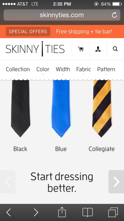
1. Skinny Ties
A family business found in 1971, Skinny Ties has built its name designing and producing quality neckties. With their decision to freshen up the brand's identity, they built a platform that will adapt to future technological changes. Their new site was launched in Oct. 2012 and they experienced huge gains in sales metrics in just a couple of weeks after the site was introduced. For those couple of weeks, their iPhone conversion rate hiked up to 71.9 percent while their revenue from iPhone ballooned to 377.6 percent. Their bounce rate dipped to 23.2 percent while their overall conversion rate increased to 13.6 percent. Also, their revenue from all devices shot up to 42.4 percent.
2. O'Neill Clothing
Three weeks before they launched their mobile-ready site (the design team used responsive elements but mobile was the secondary navigation...get a more detailed explanation here), the store took note of their conversions, transactions and revenue. They made the necessary changes to their existing website, launched it, and then monitored their metrics again for three weeks. The results they got were mind-blowing, with 65.71 percent conversion increase for iPhone and iPod. Transactions skyrocketed to 112.50 percent and their revenue shot up to 101.25 percent. For Android devices, their revenue got an astounding 591.42 percent increase while transactions went up by 333.33 percent. Their conversions hiked up to 407.32 percent.
3. Maxatec
The provider of POS & EPOS systems, mobile and barcode products decided to improve user experience for their smartphone and tablet users after they noticed an increase in their mobile visitors. After implementing responsive design, their mobile visitor goal conversion rate increased by 12 percent and the average time it took to finish a task went down by 50 percent.
4. Think Thank Photo
The company is a producer of equipment and accessories for photographers. Just like the case of Maxatec, they noticed a considerable increase in their mobile visitors and decided to rebuild their website and implement responsive design along with other optimization efforts. Compared to their 2012 figures, the new website resulted to a revenue increase of 188 percent from Black Friday to Cyber Monday. There was a 96 percent increase in transactions from users on smartphones and tablets and 224 percent increase in page views among mobile users.
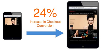
5. Nars
The beauty brand giant decided to switch to a responsive website because of limited manpower in maintaining three different sites. Their decision resulted to 54 percent increase in smartphone conversions, and 24 percent in check-out conversions from tablets.
Summary
With the way technology is rapidly changing and people are getting more dependent on their mobile devices (phones, tablets, wearables, etc.), responsive Web design is here to stay.


