5 Everyday Navigation Techniques to Master

One of the most effective ways for Web designers to help meet a company's goals and achieve the digital success they so desire, is by implementing navigational elements on their website designs that propel users forward through the sales/lead funnel.
It is, after all, one of the only ways that designers can directly influence conversions which clearly plays a direct role in an enterprises' success. Let's take a look at some of those envelope- pushing, mind-blowing, facemelting Web design techniques and tactics that are helping Web pros across various industries drive customers to take decisive, positive action.
Floating Navigation
"Floating (or fixed) navigation is a great way to ensure the user can move freely throughout the site at any time," said Josh Farkas, the founder of Cubicle Ninjas.
A floating navigational menu (see image A) rests along the top (or bottom) of a website. Since it's in a fixed position however, it will move up or down as the user scrolls. Floating navigation bars are particularly useful on sites heavy with content or with multiple conversion paths, because they keep users from constantly having to scroll to the top or bottom of the page to access links to other key sections of the website.
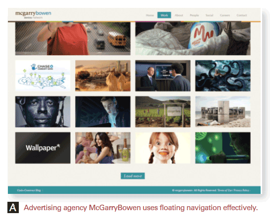
Image-Based Navigation
"The best website navigation designs that I have seen include the use of large-scale, full-page width content panels with oversized photography that include JavaScript and jQuery animations," said Anton Shepherd, the Web designer at SWC Technology Partners. "Large thumbnail images and full-scale photography effortlessly showcase content and provide a unique interactive experience."
Designers are increasingly turning to images as a means to funnel users to different sections of a website. While this strategy can require immense creative effort, being conscious of the visual nature of the modern user experience may pay big dividends to a company's bottom line.
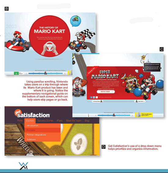
Parallax Scrolling
"Right now, I'm really interested in the HTML5 parallax- scrolling design, which provides a unique experience for the user by guiding them visually through the [page's] content," said Stephen McQuaide, the manager of earned media at The Search Agency and former Web designer. "This is not your traditional navigation, but it is a way to navigate the user through your content and create a story."
Parallax scrolling (see images B and C) is when the different layers of a Web page move across the screen at different speeds as the user scrolls. This allows developers to contain an immersive experience on a single vertical or horizontal page, as sectional transitions take the place of scrolling. You can read more about getting started with parallax scrolling online at wsm.co/getparallax.
Drop-Down Menus
"Drop-down menus in navigation bars can enhance the user experience," said Jessica Ivins, the senior UX specialist at AWeber. "They appear quickly, allowing easy access to sub-categories within a menu. When used in the right context, they can reduce the time it takes for a visitor to navigate [a site]."
These menus-within-a-menu provide additional navigation options when a website visitor clicks or hovers over an item within the primary and immediately visible navigation menu. Using drop-down menus helps designers not just make navigating a website easier for users, but also de-clutter both pages and menus. It's even useful, as you might imagine, as a means to provide a hierarchy of information (see image D). However, drop-down menus can become problematic if designers rely too heavily on them.
"Drop downs work best as an enhancement to a standards-compliant and functional navigation menu," said Ivins. "If a navigation menu functions across all devices, contains appropriate labels and looks beautiful, it will achieve its intended goal for end-users. The menu shouldn't depend upon the drop down."
K.I.S.S. (Keep It Simple, Stupid)
"Effective navigation bars follow the 'less-is-more' paradigm and include links to only the most essential pages within the website," said Avraham Cohn the founder and CEO of Digital Development Consulting.
"This minimalist look not only looks cleaner, but also reduces the anxiety of the viewers as they navigate through the site and, thus, improves conversions."
A minimalist website design presents a multitude of benefits for both site owners and their users. It dramatically simplifies navigation (making it easier to direct visitors to those areas of a site that will inspire conversions) and increases the speed and performance of a website, particularly on mobile devices, in addition to making the content easier to read and follow. Plus, the more minimal a site's design is, the better it is at accentuating calls-to-action and letting users know what they should do on a site.
"I'm annoyed when websites don't have a clear call-to-action," said Jeff Blettner, a Web designer at Formstack. "Every site has a purpose and, therefore, should have a call-to-action that should be stated clearly on the homepage, front and center. Scattered calls-to-action will result in scattered conversions."
Learn to Adapt
A strong, well-conceived website design should naturally utilize the best available navigation techniques to help direct users to specific aspects of the site and inspire them to convert using thoughtful routing tactics and easy-to-understand calls-to-action. As the Web continues to evolve, designers will have to work harder to come up with new ways to help users navigate their websites. Fortunately, there are plenty of creative ways to do that already, and the best part is that innovation never stops.
: More from Website Magazine :
Fontastic Web Fonts
TypeKit or Google Web Fonts? That's the battle raging between the savviest Web designers and developers. Website Magazine put the two font-as-a-service solutions in a fontastic head-to-head comparison - check it out now.


