
Heatmaps - It's Getting Hot in Here

 Leveraging Heat Maps for Optimal Customer Experience, Better Design and Deeper Engagement
The benefits of using, analyzing and understanding heat maps are numerous. The data gathered can offer proof as to where visitors do and do not click, provide useful information when designing and redesigning landing pages, help determine optimal advertisement placement, minimize shopping cart abandonment, maximize conversions of online forms and predict how visitors will use your site in the future.
There's not much heat maps can't reveal, really. We just need to know what to look for, how to track traffic on a website, and then plan accordingly.
In the case of a traditional heat map, the brighter the color the more clicks (and attention) a specific area is receiving - that much we readily know (see image A below).
That is effective, as it shows the degree to which people are interacting with live elements on a website and how a design and site structure can be improved by understanding what elements users are truly interested in, as opposed to those areas where users only consider clicking. 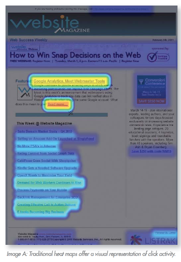 But heat maps alone do not show us all of the information needed for true optimization, as they tend only to track clicks on links. We can do much more.
Coupling heat map data with more detailed analytics lets us track and visualize mouse movement and page or mouse clicks that are not links (non-clickable elements).
In essence, we get a deeper understanding of how users are experiencing a page as a whole, not just where they click. Now we're cooking.
For example, how helpful would it be to know if users are hovering over links (often called hover time), and how often? If that information were available we might be able to determine how compelling the anchor text of certain links are, even if users did not actually click them, and how they might be improved.
We can also determine the time from when a page loads until a user clicks a certain link. This is helpful in determining if the placement we've chosen for a specific design element is optimal or if it should be brought into greater focus (above the fold, for example) to increase the number of clicks.
What heat map analytics can show with great clarity is not just how well a Web design, its layout and structure are performing in terms of clicks but also help us make modifications based on seemingly unrelated information, such as the referrer (see Image C). For example, review the highest volume entry pages by comparing the best and worst performing pages.
Then use heat maps to determine the relationship between the top referrer of those pages and clicks and lack of clicks. Once the worst offenders are found, multiple variables and landing page approaches based on the source of traffic can be tested.
Reviewing the activity of visitors from different referral sources is but one of the ways heat maps can be used. Clicktale, for example, offers statistics to its users based on existing customers versus new visitors, and customers who made a purchase versus those who did not.
"We can segment by absolutely anything. For example, age, gender, location or compare specifics such as bachelors in their 30's versus mothers versus teenagers," says Clicktale's Director of Marketing and Communication, Shmuli Goldberg. "Clicktale provides information on what content a customer really cares about, as well as finds bugs and usability issues that stop or delay revenue."
Analyzing data provided through heat maps can be cumbersome but keep these points in mind during analysis and when drafting suggestions and recommendations: 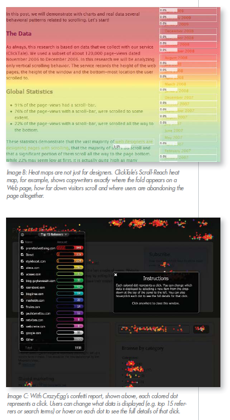 - Areas that receive few clicks could be removed. If users don't find them important they may be more of a distraction than providing help. If you're hesitant to leave sections empty, simply replace them with something entirely different to see if that leads to more interest on the part of users.
- While identifying areas that receive the most attention is useful, particularly for those responsible for optimizing content, observing the areas after they click to those destinations is perhaps even more useful. For example if users do not click anywhere after arriving on a page they may have hit a dead end. Try to turn those endings into new beginning by offering content suggestions or product recommendations.
The job of a Web designer - or anyone responsible for optimizing the user experience - is to maximize interest in the site and its products or content while maintaining usability.
The challenge is to balance aesthetics with function. To achieve this you must give website visitors a direction; guiding them where you want them to go. Too many options, however, and it is easy to confuse and frustrate users. Not enough information or choices, on the other hand, could mislead website visitors.
In the end, understand that no website is perfect. While pairing heat maps with analytics is useful, making website changes does not guarantee that all of your problems will be solved. Be sure to test, test, and retest after making any improvements and modifications to determine how those changes improved or worsened the user experience.


