
Act Responsively: Guide to Responsive Web Design

Responsive Web design has recently become a very hot topic in the digital business community.
It is an important one, to be sure, but many people are still unsure about what responsive Web design does exactly and how.
This article will explain it in the simplest way possible. There is some code that needs to be addressed, but the goal is to make this extremely easy to follow.
Definition
Responsive Web design enables websites to adapt to the different screen sizes of various devices such as personal computers, tablets and smartphones simultaneously. Thanks to the explosive growth and variety of mobile devices, responsive Web design has become a very important trend.
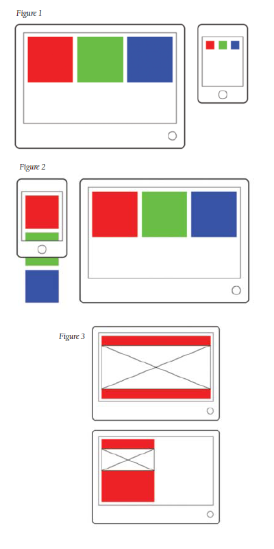
There is a big difference between the screen sizes of a desktop computer and a smartphone, and users will experience significant difficulties if your website displays the same layout for each device. There will be lots of zooming and panning required to view the content on a smaller smartphone screen (Figure 1), which detracts from the user experience.
Execution
So, how to create a responsive website? A responsive website can be created by using several CSS steps. For those who are not familiar with CSS, it is a computer language used to describe the look and format of a website's elements such as text, images, buttons, etc.
There are three important CSS steps to make a responsive website. The first step is to detect a device's screen size, or more popularly known as the media query. Below is a CSS media query example:
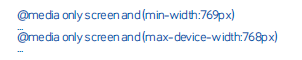 The first line is to detect a computer screen that is equal or bigger than 769 pixels, and the second line is to detect a smartphone screen that is equal or smaller than 768 pixels. The second step is the flexible grid layout. This means that the grids can adjust their width and position based on a device's screen width.
Below is a CSS example for flexible grid layout:
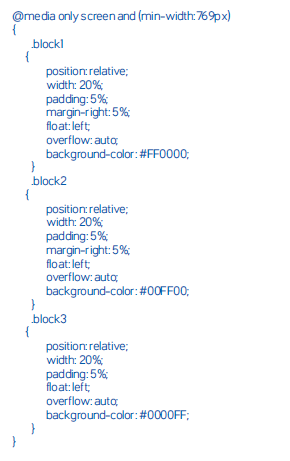
The code above shows different CSS styles for small screens and big screens. The CSS style for small screens will make the blocks stack vertically. That style is defined between @media only screen and (max-device-width:768px) bracket.
The CSS style for big screens will make the blocks stack horizontally. That style is defined between @media only screen and (min-width:769px) bracket.
In Figure 2, for example, the vertical layout on a smartphone screen will make a website's content almost as big as the layout on a computer screen.
Image-ination
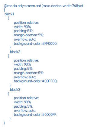
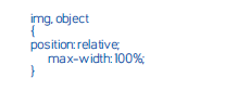
The third step of responsive Web design is flexible image or media. In this step, maximum width of an image or media will be the same as its container width.
If the container width is set to be equal to a device's screen width, the image or media width will be the same as the device's screen width. If the container width is set to be 50 percent of the device's screen width, the image or media width will be 50 percent of the device's screen width, and so on (see Figure 3).
Below is the CSS code to make a flexible image or media:
And that's pretty much it - easy, right? But do keep in mind that these codes are simple ones so that the responsive Web design concept could be easily understood. Big websites will have lots of CSS codes inside, and this will make things somewhat more complicated.
The good news, however, is that the concept behind responsive design will always remain the same - no matter how much code your website has.
About the Author: Robby Leonardi is a multidisciplinary designer based in New York City. He does illustration, graphic design, animation and front-end development for major media companies.


