
Invisible Web Design 101

Design doesn't always have to be about creation of striking art; sometimes the best design is usable, yet subtle and inexplicable. Invisible design is about more than just adding hidden meanings, layers and transparencies to design projects. Rather, it's about the creation of visually appealing, fully functional user-oriented projects.
If you feel you have to 'decorate' a canvas, chances are that you're doing too much. The best design works behind the scenes to make a project work; it is invisible; how is this achieved given that Web design is especially visual?
What is invisibility in design?
Design is visual, there's no argument there. However being visible doesn't mean that the user should be privy to all the tools and techniques you decide to employ. Much of invisible design in about creating stuff that just 'works' or 'clicks' or 'feels right.' It makes users want to interact and engage, and they can't put a finger on why.
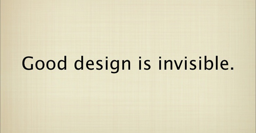
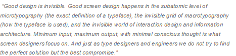
One of the best descriptions of invisible design was put forth by Information Architects founder slash director Oliver Reichenstein, given below:
Invisible Communication
In the process of creation of a mobile app, Web page or even a smartwatch user interactive interface, you're essentially designing a way to communicate. This design should support, rather than interfere with, the message.
You will use all the design and project management tools within your reach. However, in the end, you are not designing for yourself, or other designers. Rather, you're working for a wider audience that has no presence of mind to consider spacing, typography or color theory. All they know is that various things came together to create a usable, cohesive and interesting interface.
This is why design should be thought of an invisible.
Types of Invisibility in Design
There are many things that come to mind when considering invisible design. Every type is as important as the other, and has a significant impact on your end product. These include:
- Invisible placements and products - e.g. advertising or brands that are hardly noticeable (useful for game and app designers that have to pay special mind to their placements during design)
- Invisible notifications and interactions - these occur so unobtrusively that an action or a task is performed without giving a second thought to it, e.g. setting up an alert/alarm on your phone.
- Invisible aesthetics - creation of an emotional bond and/or connection with users, driving them to seek engagement.
Invisible aesthetic design techniques
Invisible aesthetics has its foundation in the very basics of the theory of design. It's not about a fad/trend, or utilization of some new, cool UX feature. It's about using the various elements of design - color, text, images, typography, technique and icons - to transmit a certain message. Below is a description of a few basic elements, and how they can be applied in invisible design:
Language and text
You use words to convey tone and elicit emotional responses from your audience. Your choice of language should communicate what you'd like the audience to feel as they interact with your design: playful, comical, formal, etc. It should elicit some emotion - like passion - and drive certain actions in response. Think about the rhyme and rhythm - how the words sound when read out loud.
Color
Every color combination creates a certain feel to it. There are cultural and emotional considerations to be made, meaning that color choice should be carefully and slowly considered. Be careful with the palette; ensure you select colors that drive your audience to perform certain actions, and to create a sense of balance, harmony and the right feel.
Typography
Typefaces also communicate certain meanings and will add a specific feel to the project. Clean sans serif typefaces like Helvetica draw their meanings from their surroundings, while more complex, black-letter typefaces like Baroque Text indicate formality. If you are not sure, stick to using simple serifs or sans serif typefaces with regular weights and uniform stroke widths.
Images
This refers to all photographs, videos and animations. What's going on in those images? Are there people, and if so, how are they feeling? Do the images have warm colors or cool? Is action slow or fast? Having proper flow and pacing will make your audience feel comfortable with your images (if moving). Having action that is either to slow or too fast would draw attention to this speed disparity rather than focusing on the actual image and the message it gives.
UI elements and icons
Having a consistent set of UI elements and icons work out great for invisible design. The set communicates to users about the workings of the site, and how they should interact with it on standard displays, even though particular looks and/or actions for each icon may be different. At the point of invisibility, the user doesn't have to think about how the element/icon works.
A perfect example is that shopping cart icon in ecommerce sites; users identify it as a chance to view selected items and/or proceed to checkout. They don't have to think about how to navigate from product selection to the final point of completing purchase; the element seamlessly leads them in that direction.
Other techniques
There is a vast array of techniques that inform the design process, and how you use them can fortify or interfere with your design. A few of these include text effects (frames, strokes and bevels), drop shadows, underlines and spacing among many more. The most important point to remember when using any effects is that if you open the tool in editing software and apply the effect with default settings, you're likely to end up with a start effect.
The idea is to apply these effects then edit them to ensure that the user looks at an image for instance, and doesn't register that it has a great shadow to it (of course it might be clear to another trained designer). The effect of the design should not be standing out, but rather blending in to further the message and goals of the visuals.
Conclusion
Just like Oliver Reichenstein noted, micro and macro elements must come together seamlessly for complete invisibility to be achieved. Every detail must be perfected down to a T. It's about purposeful, simple design.
Jack Dawson is an IT specialist and a consultant with https://webds.com/ and has been in the industry for the last 20 years. When not thinking about programming he loves hiking in his native Arizona.


