
Principles of Design

 The four essential elements for creating captivating websites
The four principles of design are balance, rhythm, emphasis and unity. Each one of them is essential for bringing together the different visual elements that are necessary to achieving a strong design, which, in turn, is imperative for a website to succeed on any level. What follows is an examination of each principle, with insights about how to incorporate them into your own Web design for optimal results.
Balance - Different colors, shapes and sizes can create different degrees of what is called "visual interest" on a Web page. It is important that pages are designed to hold a user's interest without overwhelming them or causing distraction away from the elements most important to conversion goals. As such, distribution of this interest needs to be controlled and balanced by considering each element in a layout and its "visual weight" - determined by its size, shade and thickness of lines. 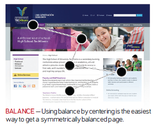 Symmetrical balance is achieved by placing elements in the design evenly. If you place a large, heavy element on the right side, you will have a matching heavy element on the left. Centering is the easiest way to get a symmetrically balanced page. But be careful, as it can be difficult to create a centered design that doesn't look flat. For symmetrically balanced design, it is better to create the balance with different elements - an image on the left and a large block of text to the right of it, for example.
Asymmetrical balance is an arrangement of unlike objects of equal weight on each side of the page. Color, value, size, shape and texture can be used as balancing elements. However, asymmetrically balanced pages can be more challenging to design, as elements are not matched across the centerline of the design.
For example, you might have a large element placed very close to the centerline of the design. To balance it asymmetrically, you could place a small element farther away from the centerline. If you think of your design as being on a teeter-totter or seesaw, a lighter element can balance a heavier one by being further away from the center of gravity. You can also use color or texture to balance an asymmetrical design.
Sometimes the purpose of the website itself makes an off-balance design the right choice. Designs that are off-balance suggest motion and action. They make people uncomfortable or uneasy. If the content of your design is also intended to be uncomfortable or make people think, a discordantly balanced design can work well. 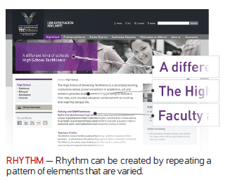 Rhythm - Rhythm in design is also known as repetition - a pattern created by repeating elements that are varied, allowing your designs to develop an internal consistency that makes it easier for your customers to understand. Once the brain recognizes the pattern in the rhythm it can relax and understand the whole design.
Repetition (repeating similar elements in a consistent manner) and variation (a change in the form, size or position of the elements) are the keys to visual rhythm. Placing elements in a layout at regular intervals creates a smooth, even rhythm and calm, relaxing mood. Sudden changes in the size and spacing of elements creates a fast, lively rhythm and an exciting mood.
Gestalt is a general description for concepts that make unity and variety possible in design. The mind has the ability to see unified "wholes" from the sum of complex visual parts. Some principles of gestalt are proximity, similarity, continuance, closure, uniform connectedness and 1+1=3 effects. 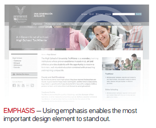 Emphasis - Emphasis (or dominance) in design provides the focal point for the piece, enabling the most important design element to stand out. To draw the reader to the important part of the piece, every layout needs a focal point.
Generally, a focal point is created when one element is different from the rest. However, to maximize emphasis, it is necessary to avoid too many focal points, so as not to dilute the dominant effect. When all elements are given equal emphasis, it can make the piece appear busy, at best, or even boring and unappealing.
Emphasis can be achieved in the following ways:
- Using semantic markup to provide some emphasis, even without styles.
- Changing the size of fonts or images to emphasize or de-emphasize them in the design.
- Using bold, black type for headings and subheads and much lighter text for all other content. Placing a large picture next to a small bit of text.
- Using contrasting colors. For example, using a series of evenly spaced, square photographs next to an outlined photograph with an unusual shape.
- Placing an important piece of text on a curve or an angle while keeping all of the other type in straight columns.
- Using colored type or an unusual font for the most important information. 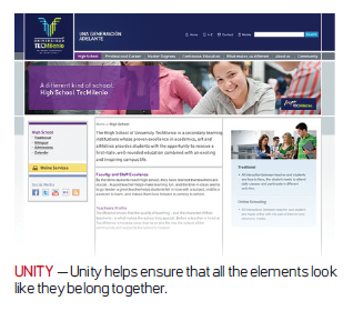 Unity - Unity (or proximity) helps all the elements look like they belong together. Readers need visual cues to let them know an article is one unit - the text, headline, photographs, graphic images and captions all go together. Elements that are positioned close to one another are related while elements that are farther apart are less so.
Unity can be accomplished through the following methods:
- Being consistent with the type font, sizes and styles for headings, subheads, captions, headers and footers throughout the website.
- Positioning elements so that those close to one another are related, while elements that are farther apart have less of a relationship.
- Using only one or two type styles and various size or weight for contrast throughout the site.
- Repeating a color, shape or texture in different areas throughout.
- Choosing visuals that share a similar color, theme or shape.
Web users rely heavily on visual clues when making decisions about a website - whether to click and explore, consider a purchase or sign up for a service. This is even more pronounced for first-time visitors when the decision to stay on-site or abandon is made in just a few seconds. Follow these four design principles and you can be sure that your users and new visitors will stay engaged with your website.
About the Author: Guillermo Cedillo is responsible for the design and implementation of modifications of different Web, desktop and mobile applications as a User Interface Designer for Sieena. Sieena is a Nearshore software development firm specializing in Microsoft technologies, with operations in Los Angeles and Monterrey, Mexico.

