How to Use Creative Typography to Craft Appealing Emails

Email marketers are seen leaving no stone unturned in order to get their emails delivered and read by subscribers. Apart from adding the right content and promoting the right offers, they also put extra efforts into giving the emails an awesome look and feel.
With more than 3.7 billion email users in the world - which will rise to over 4.1 billion by the end of 2021 - it is necessary that email marketers create emails engaging and attractive enough to garner the subscriber's attention in their cluttered inbox. While animated GIFs and interactive design elements are trending, marketers can also make use of interesting fonts and typography to capture the attention of their subscribers.
What is Typography?
The text is the most important part of an email because in case images are disabled by email clients, the only thing subscribers will be able to see is the text. Hence, it is necessary that the text you include in your email is appealing and striking.
Typography is the way text is displayed in an email copy.
Typography plays a pivotal role in emails by adding life into the text and strengthening the image of the brand.
Go through this example.
Source: Really Good Emails
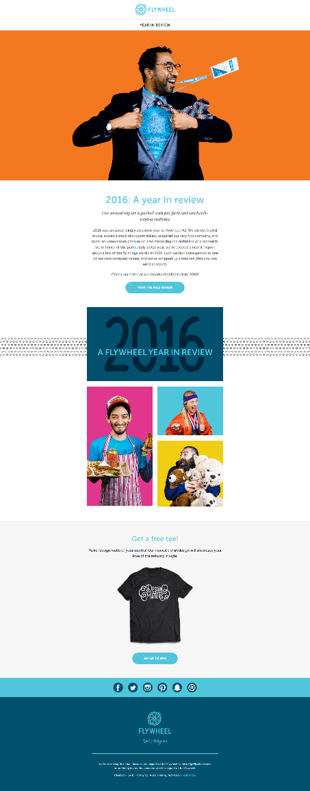
This is an email from Flywheel. The copy of the email depends majorly on the text. This is how the email would look without the images: 
Source: Really Good Emails
The font used is 'Museo Sans Rounded'. Now let us look at this email with plain and uniform text. Here's how it would look!

Source: Really Good Emails
How enticing does this email look? Not much right?
This is where typography comes into the picture - in making simple emails interesting and enticing.
The Font Family 
Fonts can be categorized into the following Family types:
Serif Fonts: Serif fonts are formal looking fonts that include characters with shapes, points, and flourishes at the end of their strokes. The most popular fonts in this category are MS Serif, Times New Roman and Georgia.
Sans Serif Fonts: These are fonts having a semi-formal look without the flourishes and they connect with other characters to give a clean look. The most popular fonts in this category are Arial, Tahoma, Verdana and Open Sans.
Calligraphy: These fonts are cursive looking, giving a continuous flow to the text. Calligraphy fonts are generally used for headings or logos in the form of a static image.
Monospaced: These fonts look like typewriter fonts and have equal space between two characters. The most popular font used in this category is Courier.
The Best Practices
Different email clients render emails differently. Those that render custom fonts correctly are:
- AOL Mail
- Native Android Mobile app (not Gmail)
- Apple Mail
- iOS Mail
- Outlook 2000
- Outlook.com App
- Safari Browser
Of these, Outlook needs you to take special measures to effectively render custom fonts. Outlook 2007-2013 override custom fonts to display Times New Roman. To render them correctly on these email clients, it requires additional codes that set the proper fallback.
To make sure your emails render well across email clients, adhere to the following best practices:
1. Choose the appropriate font
With renderability being the biggest concern for email marketers, choosing the font in emails is an important step. Serif and Sans Serif are the most preferred and most used fonts in the font family. Of these, the Web safe fonts are the most widely used ones.
2. Set a fallback
If you use custom fonts in your emails, you need to set appropriate fallback as all email clients may not render custom fonts properly. Choose a matching fallback font for your primary font. Consider the X-Height and Kerning of your fonts and select the fallback font that is close to the primary font.
You need to have three levels of fonts in your emails. If the specified primary font is not available at the user end, it proceeds to the next font specified in the code. The three levels of fallback that you need to set are as follows:
- 1st Level: Primary custom font
- 2nd Level: Web-safe fallback font that matches the primary custom font
- 3rd Level: System based fallback fonts that will render, anyhow
The code to set fallback looks like this:

Take a look at this Halloween email from Puravida that uses custom fonts.

Source: Milled
For the offer that states $10 Free, a fallback is applied so that even if the images do not load in an email client, the text and alt-text convey the message.
3. Give the right spacing
The spacing between two lines and between two characters is an important factor to consider. When subscribers read through your emails, they usually skim through long sentences and paragraphs. It is therefore important that you set the right character width and provide even spacing to enhance readability, especially on mobile devices.
Take a look at this back-to-school email by Ivory Ella.

Source: Milled
This email has an appealing look with clean and legibly placed text and font style.
4. Focus on the alignment, color, and white space
To provide a visual experience, make sure you align the text properly. With most emails accessed on mobile devices, the center-aligned text is most preferred. Keep the background light and emphasize on the font colors with uniform white spacing to make the text legible.
Check out this after Christmas email by Top Shop that has kept a fair balance between the text, its color, and white space. 
Source: Milled
Wrapping Up
Now that you know the importance of using typography in emails, get creative with your next campaign. Today, designing beautiful emails with modern typography and fonts is easier than ever.
With the holidays approaching, you can innovate with various combinations of font styles and colors to make an impression. Using custom fonts and providing the right fallback for them will, to a great extent, help you in making the emails stand out in the subscribers’ cluttered inbox.
Have you used custom fonts in your email campaigns? If not, it’s time to harness the power of typography to create striking emails.
About the Author
 Kevin George, head of marketing at EmailMonks - one of the fastest growing email design and coding companies, specializes in crafting beautiful email templates, PSD to HTML email conversion and free Master Email Templates. He loves gadgets, bikes, jazz, and breathes ‘email marketing’. He is a brand magician who loves to engage and share insights with fellow marketers. Feel free to connect with him on Twitter and LinkedIn.


