
4 Welcoming Navigation Menus

Website visitors - especially first time ones - are like house guests.
Web designers and developers need to understand what visitors need and then supply information to their virtual house guests based on those specific interests. Good navigation menus work in the same way. And, although there have been a variety of unusual and interesting approaches to navigation in the past (which may be appealing to only the most daring designers, developers and digital businesses), the best navigation on the Web welcomes users with the idea, "my house is your house."
Let's knock on a few virtual doors of websites doing navigation right.
Dove
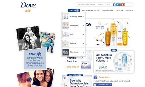
Non-traditional navigation (essentially anything other than a top-level horizontal bar with drop-down menus and text) has a purpose. Will Devlin, senior marketing manager at ShopVisible, suggests part of a brand's personality can be reflected with different navigation styles. Dove, for instance, uses traditional navigation with a twist, as users can expand the top categories and sub-categories to find imagery that will guide them deeper into the site (see image A). Image-driven navigation creates a visual, laid-back experience, according to Devlin.
Naked Juice
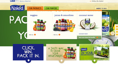
The goal of navigation is to make it easy for users to move or "navigate" a site. The mistake that brands often make, according to Devlin, is showing users every category and brand available in a top-level menu. Naked Juice shows restraint with its two- category menu, which expands (playing homage to traditional drop-downs) into images (similar to Dove's). Naked Juice refrains from over-complicating its navigation by eliminating additional dropdown selections, instead opting for a "see all" if users want to, well, see all of their products in one of those three product lines (see image B).
Lou Malnati's
The best hosts are able to accommodate the needs of their house guests by, for example, age, interests or length of stay, but Web designers and developers must welcome Web visitors based on assumptions made from previous behaviors and interactions.
ShopVisible Front-End Developer Alex Pineda recommends surveying how users are navigating the site: what works and what's confusing to them.
"Understanding users' habits and needs and how those align with business goals, will help direct a retailer to the appropriate navigation style," said Pineda.
Lou Malnati's - a Chicago staple for deep dish pizza - was clearly given this advice when it enlisted the help of Orbit Media Studios for its website redesign that now addresses users' common goals. Orbit Media gave them a brand new responsive site, which includes a full menu and photo galleries, as well as an easy-to-use store locator, integrated WordPress blog, filterable careers listing, social media and FAQs.
These items were showcased by importance, as Orbit Media created a streamlined experience based on what tasks users typically need to accomplish, like accessing location information, seeing the menu, viewing catering options and shipping Lou's pizza (a popular feature that lets "Lou lovers" ship Lou Malnati's products cross country).
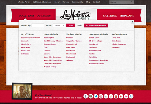
What's impressive about the location element of its sub-navigation menu is the ability to filter by city, zip or geotargeting ("use my location") - all from within the navigation (see image C). This easily accommodates its guests with local intent ("how do I find you?") rather than pushing content they might not need or want in that moment.
DIESEL
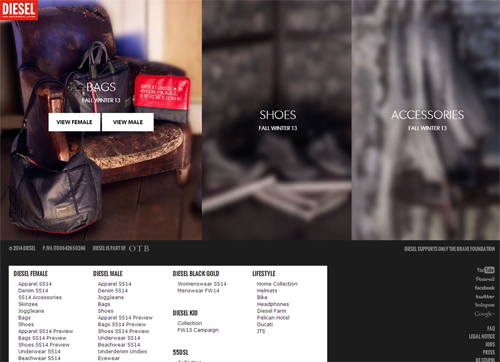
Part of understanding an audience is knowing how comfortable they are with technology and how far a designer or developer can push the digital envelope. For instance, DIESEL caters to a younger (mostly Millennial) audience and can afford to use less traditional navigation approaches without alienating its visitors. Its website presents three menu choices - bags, shoes and accessories - and then once a shopper clicks on a menu choice, there is an option to select male or female (see image D). Once selected, the consumer is directed to an even more uniquely designed product page.
Planning the Visit
Lack of data about how users navigate a site makes it challenging for users to find what they're looking for, because designers and developers are unable to create navigation menus based on those observations.
"By knowing what types of users come to the site, what they're typically looking for and how they shop, the navigation can be better tailored for easier use," said Pineda.
By leveraging these insights to provide Web visitors with a more welcoming experience, brands can provide their guests with everything they'll need for their stay via a very methodical approach to navigation menus. After all, in life and on the Web, the best hosts don't just say, "mi casa es su casa," they show their guests the way.


