
Need More Customer Data? Improve Your Design.

For most businesses, customer data is as good as revenue. When more customers give up their names, email addresses and other forms of personal information, you get valuable ammunition you can use in your future marketing campaigns-or maybe a direct line to a possible sale.
Most modern business to business (B2B) and service-based companies use form-based calls to action, which prompt users to leave their personal information in exchange for something small, like exclusive content or a special offer.
It's no secret that design tweaks can help improve your chances at achieving this type of conversion, but a new study suggests that Web design and the type of information displayed on a given screen can significantly indicate whether someone chooses to disclose personal information about him/herself-and how much he/she discloses.
Throughout the experiment, several things were changed, include the placement and prominence of privacy statements, and the layout of items in the interface. However, little of the core content or approach were altered. This suggests that a handful of simple changes to the layout of your landing page and the type of information you present to your customers can greatly increase your conversion rate.
Increasing Trust
One of the biggest design factors responsible for getting people to disclose personal information more willingly is trust. If your design and content naturally makes people trust you more, they'll be more likely to hand over their information-they're less worried that you'll abuse the information, and if their expectations aren't met, they feel satisfied that someone on the other side will help them attain a resolution.
Trust comes in many forms, so how you build that trust is up to you. You could prominently display your privacy policy, as well as describing how you're using (and not using) that information-the study referenced above found that fuller, more transparent disclosures of privacy policies led to more personal information being disclosed. You could also include markers known as "trust badges," which display different affiliations and accreditations of your company to prospective buyers. For example, if you're a "top rated" seller on eBay, or if you use SSL security, you could feature a badge that conveys that information to customers.
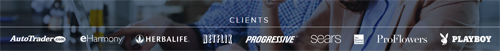
Aside from that, you can include customer-submitted information, like reviews or personal testimonials, to show that your company is worth doing business with. Videos tend to be the most helpful, as they're harder to fake, but written reviews can help too. You could also prominently feature your personal brand, if you have a strong reputation in the industry or some worthwhile affiliations like an impressive client list. 7Search.com, for example, shares its most well-known clients on its homepage:
Making It Easy
Other design changes that can influence how much information a customer discloses involve making it easier for a customer to disclose it. Here, you'll have to strike a careful balance, since making the process easier for customers often means reducing the total amount of information they have the opportunity to disclose. For example, narrowing your conversion form from 10 fields of personal information to 4 can significantly increase your total conversions, but reduce the amount of information you gain from each conversion.
The best way to approach this is to make the point of first contact as minimally invasive as possible-two or three fields is enough to get a good start. From there, you can always work to attract more information through a branching path. For example, offer a line that asks whether a user would be willing to conduct a brief survey about their habits and interests-those who mark "yes" can be followed up with for more information, and those who mark "no" can still be used for what information they did submit. This approach allows you to collect the most amount of information that people are willing to give-without alienating the stingiest customers in your user base.
Grabbing Attention
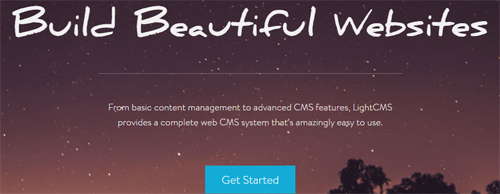
Last but not least, you'll need to include design and layout elements that grab your customers' attention. Having a call to action off to the side, practically invisible, will do nothing for your bottom line conversion rate. Including it prominently, with strongly contrasting colors and energetic wording that encourages action, will. While "Get Started" isn't the most exciting copy, the blue in the call-to-action below (from Light CMS) works great against the other colors on the page to draw attention.
However, if you go overboard and make your call to action obnoxious and over-the-top, you might end up making your offer seem like a scam, which negates any trust you might have built through other changes.
The key here is to offer a sleek, eye-catching, yet professional layout that encourages people to take action. You'll have to play around with different color schemes, pictures, and other design elements to see what works, but there are no clear shortcuts here.
It's common knowledge that the design of your pages and calls to action can affect whether or not people convert, but the type of design changes-and the content you do or do not make available-can dramatically affect not only whether people convert, but how much information they'll be willing to share with you. Experiment to see what layouts and offers tend to accumulate the greatest amount of customer information, as the more information you can get, the better.
Larry Alton is a professional blogger, writer and researcher who contributes to a number of reputable online media outlets and news sources. In addition to journalism, technical writing and in-depth research, he's also active in his community and spends weekends volunteering with a local non-profit literacy organization and rock climbing. Follow him on Twitter and LinkedIn.


