
Responding to the Hype Around Responsive Web Design

The hype surrounding responsive Web design (RWD) was substantial for digital marketers in 2013.
For those without a responsive site, chances are good you've at least thought about making this a priority, especially if you are in the ecommerce space. As is true for most fads, however, being caught up in the excitement of responsive design doesn't mean it is a perfect solution for every enterprise, or that those who are implementing RWD on their sites are doing it well.
If you're thinking about responsive design - and you certainly should be - you can avoid making some of the mistakes made by early adopters. Long page load times have been atop the list of RWD concerns for some time, but that issue is only the tip of the virtual iceberg. There are far greater considerations to keep in mind when responding to the hype of responsive design.
Focus on the user, not the screen
With so many devices and screen resolutions to juggle, it's easy to get bogged down in technical details and forget about users. Rather than thinking about how a website will render on different size screens, think about the experience those users will have when browsing a website on different devices. Web visitors expect a similar experience regardless of the device they are using, and when that experience changes dramatically they are more likely to leave.
Just as important, think about how easily people will be able to interact with your site on all of their devices. Users won't care if a website is responsive or not, but they will care whether they can accomplish what they want to do. If links are too hard to click, pages take too long to load, or navigation is not "fat-finger" friendly, the site has failed. And that can happen to a responsive site just as easily as to one that isn't.
Maintain clear interaction cues
When site visitors are using laptop or desktop computers, they have the advantage of relying on their cursors to indicate what is "clickable." Without being consciously aware of it, many users actually "read" with their mouse - moving the cursor along with their eyes. However, on mobile devices there is no hover behavior and no cursor that turns into a finger whenever it passes over a link. What's more, because viewing websites on mobile devices is generally quite slow, most people are reluctant to start tapping all over a page. This means that design must make it visually clear what elements on the site allow for user interactions. Buttons, links, form fields and other points of user interaction must be large enough to be clicked easily, and spaced far enough away from other page elements that users don't risk clicking the wrong elements.
Invest time designing the right navigation
Navigation is one of the most important elements of any website, regardless of the viewing device. But poor navigation design for visitors on mobile devices is not just a nuisance; it could make a site practically unusable.
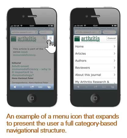
Effective site navigation helps users find what they're looking for, as well as understand where they are within a site. But with as few as 400 pixels of width to work with on mobile devices, it can be challenging to determine how to present navigation without it becoming the center of attention. The best solution is often one in which the navigation is there when users need it, and hidden when they don't. Some sites do this with a menu icon (see image), a symbol that is growing in popularity but hasn't yet reached "convention" status... yet. This could be an option for those who know their visitors are savvy Web users. A safer approach for many sites will be to use a drop-down or "select" menu. The user simply clicks the menu and scrolls to the selection (or category) of interest.
The worst thing you can do is try to shrink the menu to fit the device. Many organizations with large, complicated menu structures have attempted this solution and the result is generally a long list of tiny links that are nearly impossible to click without first pinching to enlarge. Avoid any solution that doesn't feel natural and effortless to users. And if there is an information architecture problem, it should be dealt with at the root level before even thinking about going responsive.
Recognize that customer journeys are device-centric
Before an enterprise starts a RWD project, it should review its site's analytics reports and segment visitor paths and conversions by device, screen resolution, window resolution, browser and operating system. Even if the data isn't entirely accurate it will provide a glimpse of how visitors behave differently according to device.
Plenty of statistics exist that illustrate how behavior and intent change by device. For example, a visitor who adds an item to a cart on a smartphone is four times less likely to purchase than a visitor from a desktop (source: SeeWhy). In addition, 90 percent of people move between devices to accomplish a goal, whether that's on smartphones, PCs, tablets or TV (source: Google).
BONUS: Show Emails Responsive Love
Many marketers are considering how to implement a responsive design on their website, but few have extended the same focus to their email marketing campaigns. According to GetResponse, 41 percent of emails are opened on mobile devices, but only 25 percent of marketers are optimizing their emails for mobile (source: Econsultancy), however. With more than 200 different screen sizes and resolutions (and counting) already in existence, it goes without saying that many people receiving your emails are probably not seeing the message as you intended. Recreate your email templates in a responsive format with these five templates for merchants.
That last statistic is particularly powerful. What makes people jump between devices to accomplish a goal? It might be that they aren't able to easily accomplish their goal on the device they started with. Or, more likely, it is that they have a different intent in mind altogether. For example, if you are visiting a hospital website from a desktop you might be looking up services, trying to find a doctor, checking to see if your insurance is accepted and so on. But if you are on a smartphone, you're primary goal is likely to get a map, a phone number or visiting hours.
Whatever the key customer journeys are for your site, they are likely to vary by device type. Designers need to know enough about visitors and their goals to ensure responsive design considers these different goals. The goal should be to understand what role a smartphone or tablet visit may play in the overall visitor journey, and to make sure the responsive site meets the needs of visitors by presenting the right information on the right device at the right time.
Go responsive responsibly
Today, many assume that RWD is necessary. Accepting the reality of a multi-device world however doesn't make a responsive design framework a forgone conclusion. In fact, the responsive approach has some drawbacks that can be avoided with a dedicated mobile site. Enterprises need to weigh the pros and cons of both approaches to decide what's best for their users.
And remember that a responsive site is not necessarily a high-converting site. Most who create responsive sites are trained in Web development, not usability or conversion-rate optimization. The measure of success for a website, whether responsive or not, will always be conversion rate. Think less about the screen and more about getting your users to their conversion goal.
About the Author: Tim Ash is the CEO of SiteTuners, Chair of Conversion Conference and bestselling author of Landing Page Optimization.


