
Building Better Landing Pages for Better Lead Generation

Many prospective clients or customers don't land on a company's homepage when researching their products or services; rather, they click through an ad, email, social post or search result to find specific info they need in which to base their decision.
This means that the nice-and-tidy conversion funnel that brands have set up for people visiting their homepage is likely not be followed. All is not lost, of course, because landing pages are some of the most valuable digital real estate brands have -- when they know how to properly build them for lead generation. Here are some tips to ensure visitors' information can be captured in order to market to them later with relevant information that fits where they are in the buying cycle, who they are, what they are trying to accomplish and even where they came from (like social).
Make Sure It's Mobile
Despite most Web professionals and their mothers knowing that Web visitors are accessing sites on their mobile devices, it bears repeating that because of this, landing pages should be optimized for mobile users. Not only should they render properly on the smaller screen, but they should also have large enough calls-to-action (CTAs) to avoid accidental clicks. Additionally, forms should be shorter as mobile users are likely even less inclined than their desktop counterparts to fill in a number of fields. Additionally, companies should consider adding functions that are unique to mobile experiences, like click to call.

Optimize Forms
No one likes filling out forms - unless the reward is something pretty cool. When it comes to lead generation efforts, a call from a company, a T-shirt or a whitepaper doesn't really classify. Brands must optimize their forms in every possible way to encourage completion. Fortunately, there are plenty of ways to do so.
1. No pinching and zooming - ensure forms are mobile friendly.
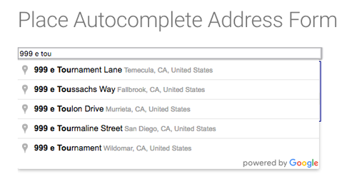
2. Help them with info - fill in addresses using autocomplete and use drop-down menus when appropriate (e.g., business size versus title).
3. Recognize returning users - populate their information into the fields, automatically sign them in and/or present them content that is relevant to what they previously showed interest in.
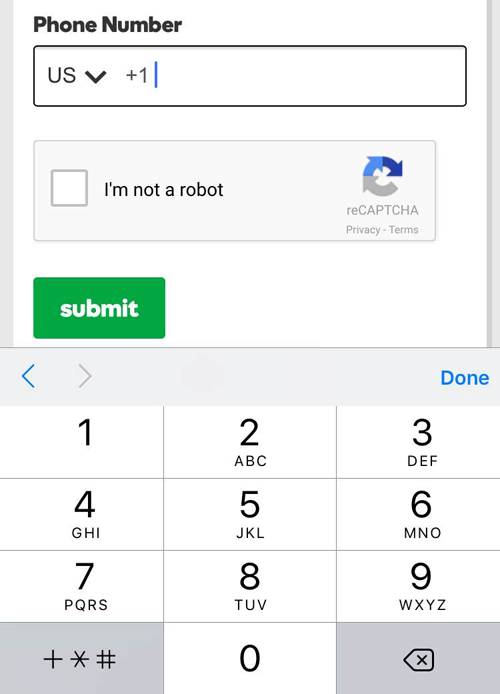
4. Use mobile's functions - if a form requires numbers to be inputted, use a touch keypad to make that process simpler and more mobile friendly.
5. Only ask for what is necessary - there are plenty of opinions here but getting as little information needed to market to them relevantly later is best practice. For instance, a software company gating off a whitepaper with a form should ask for (1) professional email address, (2) name, (3) phone number, (4) company size and (5) person's title. That's a lot of information to use for marketing reasons later on. A more consumer-focused company, however, may want to add "birthday" (without the year as many find that intrusive) into that form or "reason for shopping," which will allow for more 1:1 marketing experiences later.
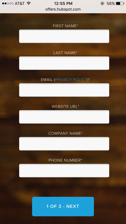
6. Provide length indicators - if a company does go for a longer form, it should include information that indicates how long the form will take to fill out, like this is "1 of 3."
Always Provide a Way Back Home
Landing pages have a variety of purposes, but should always include a way for visitors to head to the homepage; most sites do this by linking their logo to the homepage as well as ensuring the site navigation used throughout the website is identical on each landing page.
Consider the Call-to-Action
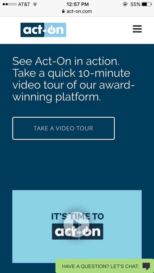
What should a visitor do when they get to this page? If they're done reading information, how can get take action from there? CTAs are the backbone of marketing, of course, but there are still plenty of bad examples out there of sites not including a CTA for visitors to follow to get them in a sales funnel. CTAs should have strong and relevant copy (like Act-On's), while the color and placement should be tested if site traffic allows for a big enough sample size.
Offer Social Login
By signing in with their Google, Facebook, Twitter or LinkedIn credentials, website visitors don't have to fill out forms (short or long) and can access the information they desire quickly, while brands still get a person's email address, affiliation and more. It's a way to capture their information and market to them in relevant ways later.

Encourage App Download
If a customer is on their mobile devices and a brand has an app, it behooves them to recognize the device and offer their app (through deep linking) - as they typically provide a more immersive experience.
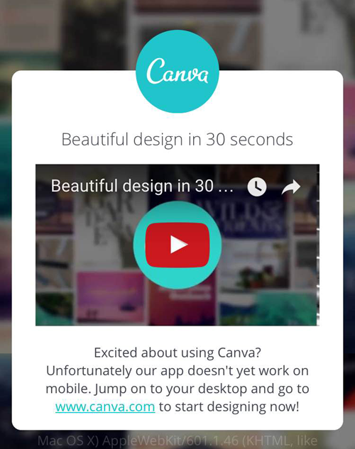
Include a Video
Many people are visual learners so there is no amount of text that can be written to help them understand what a business is providing or selling. A well-made video, however, could encourage them to enter the sales cycle (by filling out a form or contacting the company directly).
Happy Building!
Landing pages can be optimized every which way, but ensuring they are not only accessible but also intuitive to the device a person is using, is a great step in ensuring a visitor will enter a sales funnel. Further, gathering information from quick forms, social login or app downloads is a great way to market to them further, while providing them relevant info based on who they are and what they want to accomplish.


