
5 Landing Page Barriers Killing Mobile Conversions


Landing pages help everyone from retailers to service providers gather leads for their business. Now, however, as most people access the Web through mobile devices it is important to optimize these important pages further for these devices.
Here are five crucial barriers that kill your landing page conversion rate on mobile devices.
1. Forms are long or tough to complete
Mobile visitors tend to access a site on the go and are naturally less inclined to complete long forms and will certainly abandon a page that includes a form not optimized for the device they are using.
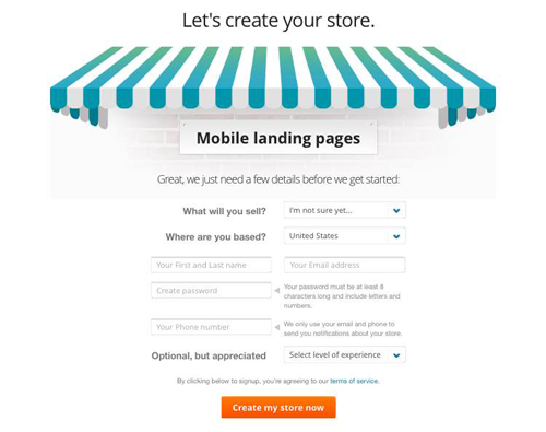
Let's look at an example. Although Bigcommerce.com has a beautifully designed website that is hyper-user friendly, its mobile landing page sign-up form leaves more to be desired. Although it's short and to the point, mobile users have to pinch and zoom to complete the required fields.
2. CTA desn't draw attention
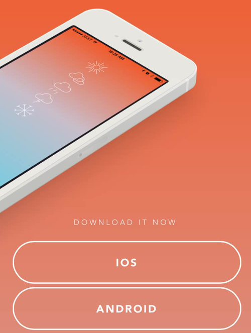
Although ghost buttons are becoming quite popular, it is the opinion of many that they don't draw enough attention to the action the business wishes a user to take. Although the example below is one of the better ones, because there are white lines around the CTA, it still could use more contrast to make it look like an actual, clickable button. Testing is, of course, the only way to be sure which CTA design is most effective, but it is common sense that viewability and clickability always win over "cool" design.
3. Requires endless scrolling
Mobile visitors hate to scroll on (and on) even more so than their desktop and tablet counterparts. If a landing page requires them to scroll endlessly to accomplish their goals, they are likely to leave the landing page.
Making the landing page content appear within just one form is crucial for better conversion rate - particularly when the text des not encourage the visitor to scroll to read on.
4. Not optimized for finger inputs
Do you ensure enough space for fingers to click on CTAs? In mobile devices touch input becomes challenging when buttons are not optimized to contain finger input. The buttons should be instantly clickable, even with "fat fingers."
5. Lacks a good first impression
In five seconds what des a user think of your landing page? They should know the who, what and how of a brand within that short amount of time - otherwise they will not take the desired action (e.g. complete form, shop, call, etc.). User testing tools like 5-second test provide answers to first-impression questions by leveraging an unbiased audience. For a list of other user-testing tools, visit 5 Solutions For Design Feedback.


