CNN.com Gets Major Overhaul: What We Can Learn


CNN has released a redesign of their website and it is substantial. And when a property as valuable and recognizable as CNN.com undergoes a major overhaul, you can bet plenty of thought went into it.
The new design appears focused on two factors that often are at odds with each other - 1) suggesting content for users to read and encouraging clicks, and 2) helping readers find content they want. Also, you will see that the site is much cleaner and easier to scan without sacrificing content - not an easy task. To help with this effort, in part, text size has been reduced in favor of more white space and better organization. While readers with less-than-ideal vision might find this change difficult to cope with, it does offer an information-packed page without feeling overwhelmed.
Let's examine the CNN redesign in a little more detail and expose some good tips for Web professionals and designers. Below are five observations and what we can learn from them. Below that are screen captures of the old and new CNN.com to help illustrate.
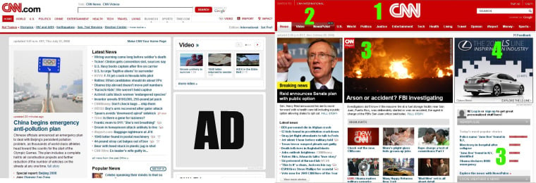
- Branding is everything. What stands out most on the new page? Red. Over the years CNN has become known for their red logo. However, they have now gone to using "CNN Red" as an entire branding mechanism in itself. It's bold, and looks authoritative. Closer attention to the logo shows that not only is it centered on the page (it's impossible to ignore when the page opens) but they dropped the ".com" - now it's just "CNN." This is worthy of some attention and might even spark some debate for your business. CNN is making a statement here; they are more than just another website, they are a leading, globally respected news source who need not remind users that they are "on the Web."
Should you consider a similar step for your site? That depends. If you are a pure online presence, billing it as such with "YourBusiness.com" makes more sense than just "Your Business." After all, the point to drive home with users is that you are an online business. However, if you have brick and mortar locations, or other offline branding channels (such as a print publication or physical product) dropping the ".com" has its merits. For one, it signals that you are a major, respected brand and not just another website or affiliate. - Navigation is key. Another not-so-subtle change is that navigation elements are prominently displayed at the top of the page. Before, navigation links were small and obscure - a reader's eye was drawn to just about every other element than the navigation. Now, you immediately see the option to get straight to what you want. At the same time, the strong images, "Highlights" and "Latest news" directs readers toward discovery. It's a very nice balance that is incredibly user-friendly.
- Community is driving interaction. Of course, it helps that the image in the center of the page is a raging inferno, but you'll notice that the most prominent portion of the page comes from iReport - CNN's community-driven news source. Also notice the "Newspulse" section on the bottom right. These stories are displayed according to readers' interests. Users can filter through all the stories on the website using this feature.
What you won't see on the home page are links to CNN's Twitter or Facebook account - these are reserved for interior pages. While it's tough to recommend that you omit your business' social links from your home page, it's interesting that CNN took this route. It almost suggests to readers, CNN.com is your main destination for news and information, not Facebook or Twitter. Is this an effort to control content or simply a way to reduce clutter? Either way, it's a little reminder that our websites are the key to our success. Yes, you want to establish a presence on other websites and networks, but you want your users on your site. - Advertising is on even ground with content. Even if it's only one ad, the Lexus ad on the new page shares top billing with the rest of the eye-catching elements of the page. On the old site, the feature story's image was most prominent, then "Video." While video is nice, it takes attention away from the ad ('AD' in the screen capture below.) Advertising still drives revenue and keeps websites afloat. Keep this in mind when designing your page - advertisers will.
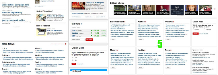
- Below the fold is not an afterthought. Below the fold (the portion of the site a user must scroll down to see), CNN's home page features a new, four-column layout as opposed to the old sometimes-two-, sometimes-three-column option. It holds a ton of information, but is airy and elegant, well-organized and well-balanced. The "Editor's choice" section allows for some light browsing while the other categories let the user dive deeper into categories with a quick scan.
Now look at the old CNN.com below the fold. In comparison, it's hectic. It's difficult to know where to look, white space is not evenly distributed, and There simply is not nearly as much "usable" information. In short, it looks thrown together. See the difference by scrolling down the page at CNN.com, and this CNN.com from July 31, 2008.
Keep this in mind with your own website. If you're lucky enough to get users to scroll down your site, don't turn them off as they explore.
Altogether, the new CNN.com focuses on usability and the delivery of a large amount of information in an easy-to-digest format. Web users have plenty of options from which to get their news, so CNN decided it was time to freshen up. They seem to have accomplished this task while staying true to their mission.
Also read: The LA Times' User-Centric Redesign