5 Ways to Go Beyond Google's Mobile Minimum


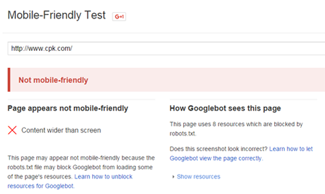
So you survived Google's deadly "Mobilegeddon" update. You've run a clean test of your site's mobile-friendliness and according to Google, every page of your site is optimized for mobile.
Congratulations, you've passed Google's baseline qualifications and you've successfully avoided any kind of ranking or visibility penalty.
Here's the issue: these truly are baseline qualifications. For Google to consider your site "mobile friendly," you don't need a lot of bells and whistles. You only need a site that can load fully and easily on a mobile device, without Flash and similarly unsupported features, and with text that can be read without scrolling or zooming. These qualities are good (and some big brands don't even offer them), and serve as a good foundation for a mobile site, but they don't help you stand out from the crowd.
If you want to make a bigger impression on your users and offer a better mobile experience than just the default, you need to make correspondingly better improvements.
For example, here are five easy ways you can make your mobile users happier with your site:
1. Reduce loading times
A slow loading site can instantly turn away an otherwise interested and valuable user. The faster your site is, the happier your users will be, and on mobile devices that's even more evident.
Make sure you have a good caching plugin or similar system, and reduce the size of all your images. You'll also want to get rid of any unused drafts or similar scrap material taking up space in the back end. Also, try to use a simple, standard font. Specialized, custom fonts can give your brand a more unique image, but can force mobile browsers to spend more time loading those fonts, which can cost you precious seconds.
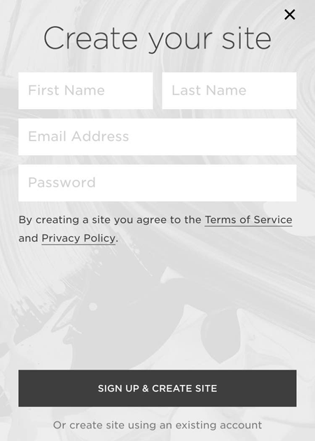
2. Simplify your forms.
Forms are one of the most useful ways to secure user information and score conversions, and as you should know from best practices on desktop sites, the simpler your forms are, the better. Long forms can turn away otherwise interested users, and complicated forms can confuse and frustrate them.
In the mobile world, this rule is even more important. Selecting and typing in forms on a mobile device takes significant effort, so if your form is longer than three fields, forget about getting any mobile conversions. You'll also need to be sure your form is visible, easy to click, and with a submit button that doesn't disable (since mobile connections are less reliable than their desktop counterparts). Squarespace provides a good example, but it only collects the information needed at that moment, knowing more information can be gathered as a person interacts with the site or brand messaging.
3. Get rid of fixed positioning
It's pretty common for modern sites to have a fixed position for their headers or sidebars; doing so ensures that these features remain in one place, constantly visible throughout the entire website experience. However, there are a few problems that can arise in a mobile format.
First, headers and sidebars can serve as distractions. If your user has no interest in seeing or clicking on them, it could ruin the experience of the entire site. Second, if your user takes a moment to zoom, it will also zoom in on the header and/or sidebar, blocking out all or most of the screen.
4. Smooth out your navigation.
A clear, easy-to-read navigation is a must for any website, but it's especially imperative for mobile users. Generally, mobile users have a specific goal when they come to your site (whether they're looking for information or a specific function), and they have neither the time nor the convenient functionality to look through every page and sub-page of your site to find it.
Keep your navigation available in a corner of your site no matter which page your users are on (like CNN does in the image below), and make sure only your most significant pages are visible without drilling down to the next level.

This will help direct users to your most popular, most important pages, keeping a light, concise, yet helpful experience for all your inbound mobile users. It's also helpful to include large, easily clickable links to get your users from page to page-since people are clicking with their fingers and not a precise mouse, you'll need to ensure both the visibility and convenient functionality of all those links.
5. Make sure every image and video displays properly
Visual content is in high demand, but it's only worthwhile if your users can actually see it. If your images and videos don't load properly at all, you won't pass Google's mobile friendly test, so you can at least rest assured that you won't get penalized at this point. But you can do more to make sure your content is positioned and displaying properly. For example, make sure all your image widths are set to 100 percent-otherwise they will appear too wide for some mobile browsers. Run through tests on multiple mobile devices to ensure your full compliance.
If you're ever in doubt about whether or not a feature will increase the usability or user satisfaction of your site, put it to the test. Take the initiative to conduct some market research, and segment your users into a test and control group. Measure the impact of the new feature, and if it has even a slight bearing on your users' overall experience, keep it. Continue building and tweaking your site piece by piece and you'll be able to keep up with the latest trends while simultaneously maintaining the best version of your site possible.
Larry Alton is a professional blogger, writer and researcher who contributes to a number of reputable online media outlets and news sources. In addition to journalism, technical writing and in-depth research, he's also active in his community and spends weekends volunteering with a local non-profit literacy organization and rock climbing. Follow him on Twitter and LinkedIn.