How to Create a Great Looking Mobile App


When many businesses decide it's time to build a mobile app one of the first things they agree on is that they want a great looking app. Often they have some ideas on interesting features they want, but when asked to be specific they are usually short on details.
This article had been written to shine some light on a few tips that you can use to help you design a mobile app which will leave your users impressed. It will be an app that your consumers will enjoy using, and consequently, this will make them want to use it more and more.
Here are some of the tips:
Always consider the functionality of the app before anything else
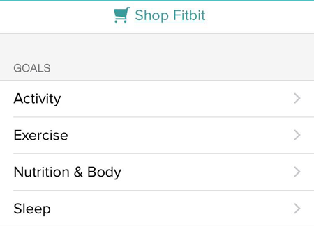
Remember that often simplicity is considered as the ultimate in sophistication. Think of just how simple looking and functioning some of the most popular apps on the market are (or at least appear to be when really the backend is quite robust) - like Fitbit's app.
It does not make sense to develop a beautifully designed app that does not serve the interests of the user. It is like having a nicely painted and cleaned car with a broken engine. You would be better off driving a not-so-good-looking car with a well-maintained engine.
As you try to impress the eyes of the user, you should also try to make sure they do not have to go through the unfortunate experience of trying to stumble their way through an app that is difficult to use. Trust me, it does not matter how good looking your mobile app is; the moment it is not in a position to serve its users, they will stop using it. They will instead decide to try out possible alternatives looking for an app that is easier to use.
You have the freedom to do things as you want them, to design and come up with the components in any manner you so wish, however, users demand apps meet their own specifications and this means that you will have to come up with the app in such a way that it is able to meet the needs of the user.
Make sure that the color scheme you come up with is able to stand out
Using the right color scheme can attract the attention of users; in fact, the proper selection of colors for use in your app can take it from something uninspired and bland and turn it into something that customers love and appeals to their psyche. Of course you will want to use colors that create an integrated experience with your branding, but remember that you don't want to design an experience so dull that it turns users away.
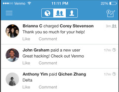
Remember that colors have meanings, which can vary depending on one's culture. These meanings influence the way your customers perceive your app, even if it's subconsciously. Therefore, the colors you choose can work for you or against you. For instance, in the United States we often associate the color green with "go ahead" due to our traffic signals. This extends into business with phrases like "green lighted." Further, the color blue is used to instill trust, so the payment-sharing app, Venmo, is wise to use it prominently in its app as people conducting financial transactions will want to trust their funds are secure.
Use color to define purpose within your app, and beyond this, use color to define a hierarchy within your app. With proper color choices users know right away which button one is most important, which is less important and so on. This will reduce indecision on the user's part and improve their overall experience with the app.
Step up your iconography
Taking some extra time with your iconography is a good move. If you are able to design icons in such a way that the users are pleased with them and able to relate with them, then they wil be more apt to use your application. They will also be more tempted to browse further through the app. Good iconography can be the difference between a dull app and an app that reaches out and grabs the user's attention.
Also make sure you avoid confusing users with vague icons that don't properly convey meaning. If you app is difficult to use, your customers will just look for other options that are easier for them to navigate. ESPN does a good job of easily identifying different actions a user can take by simple icons, like a person icon with a plus sign means someone has added a player to their fantasy team while a minus sign indicates they dropped a player.
![]()
Use animations to communicate ongoing processes
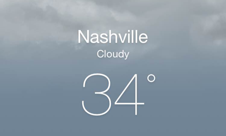
When a user is interacting with your app, providing feedback on their actions can improve the experience. Not only will it improve the user experience from a feedback perspective, but animations can go a long way in making the app more interesting and consequently much more fun to use. For instance, these days most of the weather apps are normally animated (e.g. in Apple's weather app the clouds in the screenshot below move slowly). This tends to make everything look amazing and bring users back to the app.
The feedback provided by animations that are triggered by user actions allows them to know that their message was received by the app and avoids confusion. Users have an expectation that their smartphone will respond quickly to all their actions. Beyond being functional they can add to how your app looks and even encourage interaction. Small animations can help provide meaning within your application and help focus a user's attention.
Define the elements in your app then repeat them
A lack of consistency can not only be confusing for your users but beyond that it can also dramatically hamper your app's appearance. Changing button styles or spacing throughout your app is noticeable to users and will chip away at the user experience and the look of your app.
Without consistent use of elements, users will struggle to understand what they are looking at within your application. Consistent use of elements such as shape and color will create an environment where the user can anticipate what will happen when they perform an action. You don't want to make users think when it comes to using your app; it should be as intuitive as possible.
Final thoughts
Remember that form should never be allowed to come before function. Before you start thinking of all the fancy styles you can use on your app to wow your users, make sure that your app will serve its primary objective, that is, the function it is created to perform. Use design to enhance the experience of performing this function and make sure that your design does not get in the way of it being performed. Look at doing things like reducing the number of steps which a consumer has to follow so as to use your app.
Even if you have very little or no experience designing mobile apps, the above tips can help you design a great looking mobile app.