Why Mobile Site Search Matters [and How to Do it Well]

![Why Mobile Site Search Matters [and How to Do it Well]](https://www.websitemagazine.com/hubfs/Imported_Blog_Media/local-pin-phone-image-Jan-23-2023-12-19-47-6461-AM-2-2-May-01-2023-09-31-15-1705-PM.png)
Mobile browsing is a game of speed and convenience, and building site search for the high expectations of users on the go can be an exceedingly difficult challenge.
Already tough to master on desktop, building search for mobile presents a whole new set of challenges: severely restricted screen sizes, low user patience to wade through result sets, and major demands on speed. In light of these challenges, how can we design a mobile search experience that feels natural and rewards (rather than punishes) users?
To approach this problem, it helps to break mobile search interfaces into a series of phases, then treat each as its own design challenge. These phases are:
- Discoverability
- Active searching
- Result viewing and refinement
Discoverability: how visible is search?
The first challenge for mobile search is creating a visual framework that suggests search is a viable avenue for content discovery. Depending on the purpose and function of your website, this can be done in a range of ways, with some websites choosing to centrally feature a search bar on the homepage, and others keeping search ever present in the navigation. These differences in layout reflect the relative importance of search on each website.

The varying prominence of search across these three layouts demonstrates the relative importance of search for each website.
For example, Amazon is widely renowned for their search, and search forms a central pillar of their user experience. Accordingly, search is always accessible in their mobile app, suggesting to users that if they ever decide on a specific item, they are one tap away from a central portal for discovery. By the same token, if search is not easily visible within an app or on the mobile Web, users will infer that click-navigation is a better option for moving around a site.
Active searching: how does searching work?
While discoverability will affect the amount of your mobile traffic that flows through search, the critical next step is deciding how the experience of searching will feel and function for users. Two key considerations come into play at this stage. For one, typing on mobile remains cumbersome and annoying for many users. So, developers should take steps to minimize how much typing is required. Secondly, with the keyboard occupying the bottom half of the screen, this stage is where screen space is the most limited. Accordingly, the search experience should take advantage of all available space.
The current mobile search landscape can be roughly divided into two schools of thought: suggesting queries and suggesting results. In the first and most widespread camp-which includes giants such as Google/YouTube and Amazon-users see suggested queries as they type, often with an arrow icon on the right side to "push" a suggested query into the search bar. While this option is gaining widespread adoption (in part because of its use by these giants) this experience creates an extra step between searching and viewing a specific result by forcing users to first browse a result set before selecting what they want.

Amazon suggests queries as users type, while Red Bull Music Academy's mobile site suggests a full result set.
The second camp attempt to resolve this shortcoming by presenting results directly as users type. In this model, users see results immediately as they type, and can click directly on these results to jump to a specific page or submit a full text query to view a complete result set. This approach provides the flexibility to jump directly from search to a result, while also giving users the option to complete their query and browse a full result set. Additionally, as users see this result set they can adjust their query on the fly if they don't like what they see.
Viewing and refining results
After completing a search, many users will want to refine the result set to hone in on what they're looking for. This challenge-generally referred to as faceted or filtered search-is one of the trickiest aspects of mobile search design, primarily because of the space constraints that mobile screens force on UX.
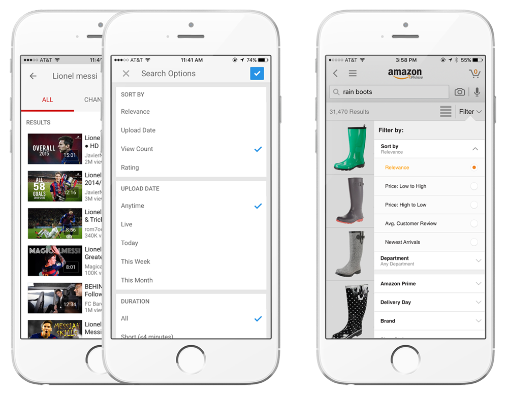
Result refinement options occupy the entire screen in the YouTube app while only occupying portion of Amazon's interface.
A creative approach to this challenge is presenting refinement options as a slide up checklist like YouTube, which combats space constraints by using the whole screen for the refinement process. Another option is to have filters drop down over half the screen, as Amazon has adopted.
Whichever options you choose, search should be an integral component of your mobile site design process. As a free text input field, search provides users the opportunity to directly communicate what they're looking for - an opportunity that should not be overlooked.
Matt Riley is the founder and CEO of Swiftype, a San Francisco-based company that powers billions of searches each month across hundreds of thousands of sites and applications. Clients range from major corporations/brands like Qualcomm and Dr. Pepper to startups like Twitch, CloudFlare, and Survey Monkey.