
Key Web & Digital Design Trends to Know

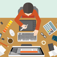
Design preferences (and techniques) seemingly change by the day (if not the hour). These changes make it quite difficult for those responsible for the visual aspects of their enterprise's user experience (UX) to keep pace, but it is certainly not impossible.
In this edition of Website Magazine's Design & Development Digest, let's take a look at a few of the dominant trends present, which will likely influence how websites (and digital experiences in general) are created, constructed and crafted as the industry moves forward.
Hidden Navigation & Evolved Menus
What began as a solution for the compact screens of mobile devices has quickly expanded into an opportunity for responsive websites at all viewports. Using hidden or expandable navigation menus (e.g., the "hamburger" menu) allows for greater flexibility (a more prominent content area as opposed to traditional navigation menu patterns). This offers more opportunity on screens for designers looking to take advantage of the available space (on both homepages and product/information pages) and who are leaning toward adopting other trends including minimalism (i.e., less clutter), flat or material design. While the argument is that hidden navigation will have a potentially negative impact to UX, there are many examples that contribute to a more evolved, modern and productive digital presence.
Streamlined Color Palettes
The use of color is one of the more continually evolving aspects of digital design. One year designers will tend to leverage many bright colors, for example, while the next year they may opt for just two muted/flat colors. It is likely designers will "tone down" their use of colors and focus on crafting experiences with a smaller color palette to not overwhelm users, particularly on smaller screens. Color choice plays a significant role in the psychology behind marketing so it is imperative designers choose wisely.
Split/Stacked Screens
Designers looking for a highly versatile layout may want to explore a split-screen approach. The technique features a side-by-side, panel-style for desktop viewports and stacked elements for mobile devices. Since the approach is quite symmetrical, it works very well with certain types of content, such as when designers want to make a visual connection between two items or to emphasize the duality of elements. Contrasting colors and bold typography work perfectly with this trend as well.
The Next Trend is Emerging Now
Trends emerge continuously, of course, so it is difficult to pinpoint what will be adopted for certain; one day the use of geometric shapes are all the rage, for example, the next they are not. Web designers, all designers really, pride themselves on their creativity so the industry never really knows which direction any of us is actually heading. What is impossible to deny, however, is that design opportunities are expanding (as are designers' skills) and its impact is being felt well beyond the website.
The Rise of Material Design Lite
Google's popular Material Design aesthetic has truly exploded over the past few years. Designers embraced it for its ability to add a sufficient amount of embellishment to enhance usability without sacrificing the same. In the future, designers expect a new phase of the trend to emerge and that is exactly what is happening with the rise of Material Design Lite (see image from getmdl.io), a more flexible version of Material Design that can be implemented in whole or in part for nearly any Web design.


