Digital Ad Creative Checklist

Consumers are bombarded with display advertisements at every virtual corner of their online experience.
The result is a phenomenon called "banner blindness," when consumers, either consciously or subconsciously, ignore the majority of display ads they encounter. To beat banner blindness and stand out from other ads on the Web, brands must be strategic in the construction and development of their campaigns.
To make sure your ads have the best chance of engaging consumers (and eliciting clicks), use Website Magazine's digital ad checklist as a guide for the creation of your next campaign:
1. Identify goals
Before design brainstorming sessions take place, advertisers must know the goal (or goals) of their new campaign, as this has a direct impact on the campaign's development.
For instance, Sizmek Product Marketing Manager Brett Sanderson notes that brands looking to boost engagement metrics may want to leverage interactive, rich-media ads, while brands looking to convert consumers may be better suited for a traditional retargeting ad. He also suggests the following:
Decide on campaign goals well in advance to inform creative strategy.
Use key performance indicators to drive the campaign's creative layout, hierarchy and priorities.
Since users are much more likely to engage with an interesting interactive ad right on the page, versus clicking off to a separate landing page experience, is appropriate for retargeting and other performance-based campaigns where there is a true incentive for the user to click.
2. Keep it simple
Once campaign goals are identified, marketers must keep simplicity top of mind, because cluttered designs tend to underperform, hampering a brand's ability to convey the primary message of its campaign. In addition to clean design, marketers should keep headline copy concise and benefit-oriented to drive engagement and conversions.
Take jewelry retailer Pandora as an example (see image). The company uses minimal copy and a date to grab consumers' attention and create a sense of urgency. The copy is highlighted by the abundance of white space, which also helps showcase the delicate necklace featured in the ad.
3. Give value to CTAs
The most important design element of any advertisement is the call-to-action (
"If possible, try offering something of value to your audience, such as 'Get coupon now' or 'Download the report,'" said Sanderson. "Continuously experiment and try new and fun things. There are far too many generic 'Click here' and 'Learn more' CTAs out there - but something unique to the execution attracts more attention. In fashion, for example, 'See more styles' or 'Get the look' could invoke a stronger emotional response from the user."
In Pandora's ad, the retailer uses "Discover Now" on its CTA. This verbiage is a refreshing change from the common "Click Here" and also provides value because the ad was targeted to people who had not yet purchased a Mother's Day gift, and still needed to find, or "discover," the perfect present before the holiday. It is also important to note that brands can use animation to attract attention to CTAs. Sanderson warns, however, not to let animation obscure the CTA. Additionally, exclamation points should only be used in CTAs when appropriate. For instance, "Learn More!" doesn't make much sense, but "Get our limited-time app for free!" could boost the ad's performance because the punctuation is relevant to the copy's sense of urgency.
4. Validate authority with logos
It is necessary to maintain simplicity in ad creative, but it is also important to include logos. Not only do logos validate a brand's authority, but they also generate brand awareness. That said, the placement of logos is significant, with a recent Rocket Fuel study revealing digital ads with logos in the lower-left hand corner averaged 81 percent higher conversion rates than online ads with logos in other locations (see image).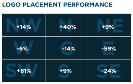
5. Maintain cohesiveness
Establishing campaign cohesiveness cannot be overlooked. This includes choosing the right color combinations to increase an ad's appeal, as well as adhering to a color scheme that improves brand recognition. "It's important to make sure that your print, broadcast and online campaign designs align whenever the product messaging is the same," said Sanderson.
"For example, a person may see your TV commercial first and recognize the brand and message. They could then come across a print ad and see the same font, color and layout, which would create a connection to the commercial they saw previously. Finally, the user could head to the Web and see an ad with familiar imagery and messaging, and even though they only gave it a passing glimpse the first two times, by the third time of seeing this concept, they may have developed enough interest to click the ad to engage and convert. Without this consistency, your audience likely won't make that synergistic connection across a multi-channel campaign."
The Optimization Cycle
While this checklist is a useful guide for better ad creative, it is important that brands continuously run tests and analyze their campaign data. After all, what motivates one group of potential buyers to click isn't the same for another.