Three Brilliant and Inspiring Animated Advertisements


Traditional banner ads have a long history. They experienced a heyday before the dot-com bust, saw a revival with Google AdSense, then saw click-through rates drop steeply as consumers succumbed to "banner blindness."
Yet, banner-style ads are still alive and well. Some are even thriving. Navigate to a few major media sites these days (and even smaller websites) and you will see a growing trend of animated ads; those that go beyond a three-frame rotation by featuring scrolling text, animated images and even interactivity. It seems these ads are on the upswing and to some, for good reason.
The arguments for animated advertisiments usually center around engagement. These ads tend to draw the user's eye toward the ad, encouraging deep branding, or engagement via a click. Working against these ads is the fact that they typically take longer to load than a traditional static ad and can draw the user away from the content -- a plus for the advertiser but often a negative for the publisher.
That said, it's hard to ignore a good online ad when you see one ... at least, hard for me to ignore. The three ads below are creatively animated, compelling and do a great job of not only conveying a message but branding a company on its strengths and consumer needs. Let's have a look.
Mrs. Dash
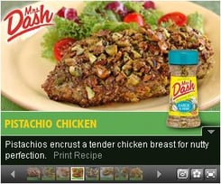 This ad is both animated and interactive. It features a series of panels that the user can scroll through, each resulting in a new image of a dish prepared with Mrs. Dash seasoning. Click "Print Recipe" at the bottom of each image and a new tab opens in the browser with a print-ready page featuring full instructions on preparation and even full nutritional data.
Why it's brilliant: The ad is interactive and voluntary to the user, making it an experience more than just an ad. It offers value to the user as well. Instead of simply promoting a product, it introduces utility by offering several recipes. What's more, the recipes move the ad beyond the Web -- when printed, the ad moves into the home and the kitchen for further offline branding.
Klondike
What would you do for a Klondike bar? Maybe click an ad? This ad starts with the classic Klondike bar that then spilts into four pieces. Next, the pieces turn and split several times over, revealing all the varieties Klondike has to offer before ending with the classic Klondike bear and photos of a few of the new Klondike varieties.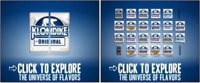
Why it's brilliant: Klondike is known for one thing and that's the classic ice cream bar. In the ad, the bar is deconstructed -- a clear message that there's more behind Klondike than what you are accustomed to seeing. The splitting and spinning of images into new flavors gives the impression of a multitude of varieties of Klondike bars. What are they? You have to click to find out. One thing remains constant with this animated ad and that's the call-to-action at the bottom, "Click to Explore the Universe of Flavors." It's a clear, prominent message, something always desirable in an online ad.
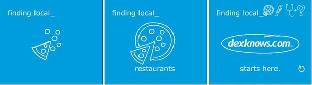
DexKnows.com
This ad uses simple line drawings (animated, of course) to showcase a few common uses for the DexKnows product in an entertaining way. In the example here, a slice of pizza is drawn, then completed with the rest of the pie and the words "finding local restaurants." The next panel sketches a faucet and the next a stethoscope connected to a beating heart for finding local plumbers and doctors, respectively.
Why it's brilliant: The drawings are completed before the accompanying text, leaving the user to anticipate, then discover what the next drawing (and the product's utility) will be. It's very simple but entertaining and effective. The ad focuses on DexKnows' core offering -- local search -- reinforced four times during the short span of the ad. At the end of the animation all three drawings are present at the top, perhaps encouraging another spin of the ad to watch the items being drawn again.