The Ripple Effect: Track Trends & Find Friends on Google+

Google+ has had its fair share of problems differentiating itself from other, more established social networks, and because of this, it hasn't exactly skyrocketed in popularity. However, it turns out that by ignoring Google+, marketers are actually missing a great opportunity to find out what content is most likely to trend and how that happens, as well as identify the biggest influencers in their niche.
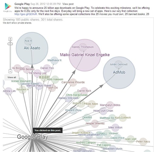
This ability is presented by a rarely discussed (and probably even less utilized) feature known as Google+ Ripples, an interactive graphic visualization attached to content or a URL posted on G+ that charts the series of a events that take place after it's shared (in other words, it shows the post's viral ripple effect - get it?). The chart follows the post from person-to-person, displaying all of the shares and illustrating who shared it and where they found it.
What makes Google+ Ripples neat is its visually appealing, zoomable and interactive interface that lets users quickly scan and study the life cycle of a viral post. By hitting the "Play" button at the bottom of a Ripples page, users can see an animated version of the same graph and watch the post get shared from the time it was first posted to the present, which lets them see the scale and speed of how it spread.
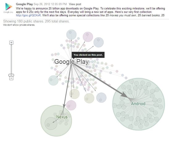
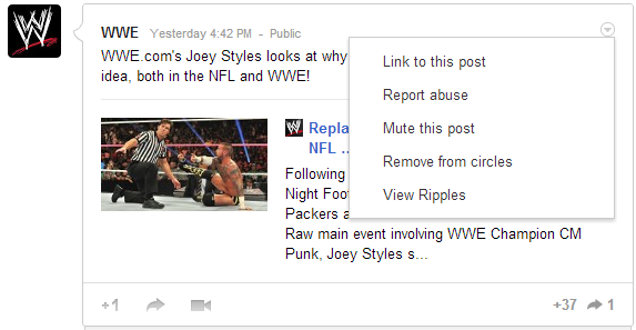
Every public post on Google+ that has been shared will feature its own Ripples page, which can be accessed by simply clicking on the arrow in the top right of a post box to bring out the drop-down menu. From here, you can just click "View Ripples" and it will open a new page with the visualization of the post's share history.
Benefits for Marketers
This sounds interesting and all, but what's the real benefit of actually bothering with this feature?
Well actually, there are two. See, Google+ Ripples is a quick and easy way to spot what type of content in your niche is most likely to foster engagement, and who the most influential people are in terms of getting it seen (and shared) by the most users. Basically, it presents a visual representation of the life cycle of content in your niche, and the people who interact with it.
While simply looking at the number of shares can give marketers an idea of what topics or types of content are most popular within their niche, Ripples can help them visualize how quickly and among what type of users it is shared. What they may find is that some posts spread fast, but die down after a few hours, while others take off more slowly and thrive a lot longer. Or, they could discover that some topics are more shared among business professionals, while others are all the rage with consumers. All of this information can give marketers a better idea of what kinds of content to post (both on Google+ and other places that they reach their niche audience) and who to target with that content.
But the real beauty of Ripples is that it shows which users were most influential in helping to spread it across the social network. Those users who shared the content from the original poster, and then saw a lot of other users share the content from them, are more than likely going to be important, major players in that niche. And Ripples not only helps to identify these folk, but also provides users with an easy way to automatically connect with them. Marketers can use this information to network and get their name on the radar of these key people in their industry.
Who knows? If you impress them enough, they may even start sharing your content. So the next time you're on Google+, it might be worth it to check out Ripples.