Ad Keyword Distribution Visualized

Last week Bing announced the upcoming introduction of a feature which will enable Bing Ads users to visualize key performance indicators across thousands of keywords and better explore optimization opportunities.
Bing's Keyword Visualization Graph is really a "big picture" kind of tool to understand performance, but the value really comes with its ability to provide marketers with insights on their most high-impact keywords.
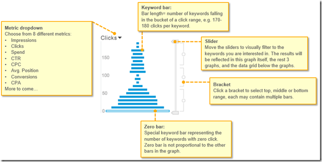
The Keyword Distribution Graph places keywords into a set of performance buckets which are represented as a bar in the screenshot below. The length of the bar equals the number of keywords falling in the bucket of a particular range.
Advertisers can choose from eight different metrics including Clicks (seen below), impressions, spend, average position, conversions and more. Users can even interact with the graph (by using the slider and side bracket features) to examine the data at different performance levels.